Monday 3 November 2014

COP2 - Subculture in animation


Subcultures are a form of rebellion against the mainstream trends and societies that brand modern life. These groups can be seen from the beginning of World War 1, with poets, writers and artists from different cultures meeting and creating artist movements such as Dadaism. Subcultures are not just fashion trends but a form of creative minds that want to break away from mainstream beliefs and ideals, producing art that influences modern artists.

Subcultures are not that relevant towards the animation discipline through how it does not generally adopt a specific brand or rebellious undertone compared to the Dada movement, however it can be stereotypically linked to societies subcultures and genres, such as 'Goths' which are immediately linked to horror genres in animation. Animation does hold a strong message with in its' work, sometimes rebelling from the normality however it does not generally become categorised into subcultures.

An interpretation of subcultures effecting animation could be cut-out animation, for example Terry Gilliam who animates with the Monty Python series, uses cut-out animation which resembles the Punk movement, with the iconic image of the queen on one of the sex pistols albums. Gilliams work was different, it was outrageous to some audiences, it went against the normal form of animation that was made at the time and the humour added with the animation was new.


Animations could possibly effect people with in subcultures through the different cartoons or experimental compositions, possibly creating new subcultures. This could possibly be seen in Japanese animation/cartoons (anime) , through how people obsess over the culture and try and adopt it into their own life.

It could also be interpreted that in todays society that any animation that is created away from the mainstream animations such as the works of Disney and Dreamworks, is within a subculture that doesn't want to be branded as work that is like the big studio companies, linked with animation that is aimed at family audiences. This could be classed as a form of rebellion that is formerly why subcultures were created.


Tuesday 14 October 2014

COP2 - Visual Analysis

Kristen Lepore -  'Bottle'
Lepore uses the animation method of pixilation to create her short film, she uses natural materials, sand and snow to create the figures in natural light. Depending on natural light meant the the photography of the scenes had to be in the same time of day to run with the previous shots, meaning the weather had to be taken into consideration as well as to ensure that the rain wouldnt ruin the sand and the snow figure as well as the lack of light.

The main narrative for this short film follows a sand figure who empties a bottle of snow which was carried to shore by the sea foam. After emptying the bottle the figure fills it with sand and puts it back into the sea. The bottle arrives to the shore of a snowy terrain and is picked up by a snow figure much like the sand figure. The bottle is then sent back and forth between these two figures with different items in them, ranging from seeds to seaweed, that eventually make facial features for both of the figures. The short film concluded with both of the figures meeting in the sea but only to dissolve before they are able to stand in front of each other.

Screen shot of 'Bottle'
The passing back and forth of the bottle reminded me of Ray Johnsons mail art, a neo dadaist who experimented and collaborated with other artists with mail. Johnson wanted to use this concept of talking to each other through mail, through the use of art, how art would be effected, what would happen if someone added to this mail art? Would this make it someone elses possession, someone elses identity. In my opinion the contents of the bottle, change the concept of the bottle, it changes just like the mail art that Ray Johnson created. The contents of the bottle changed the identity of the figures, the objects gave each of figures an appearance that each thought was an identity. This could be further linked to social media in the modern world, through how you present yourself anonymously, an artificial persona that is expected or created by the masses.
Ray Johnson Mail Art
Siri Melchior - 'The Dog who was a Cat inside'

Melchior uses computer generated 2-D animation to create his short film. She uses block geometric shapes for the dog character and curved lineart for the cats, with a mainly desaturated colour scheme.

The narrative shows a dog with a cat drawn inside its body, the audience follows the main characters as they wonder the city and how they interact with one another. The cat scratches the dog and the dog retaliates causing them to fall into the water, as they sink deeper the characters learn to work together to co-exist. As they resurface they discover another character just like them, but with the cat presented like the dog and the dog inside the cat. I believe that this animation shows the viewer a contrast of characters that we would stereotypically think that dogs hate cats and vice versa. The identity of this character is lost, the viewer question which is the most dominant role, the cat inside the dog or the dog? This can suggest that people forcibly identity the character as the dog, as the dog is more prominent compared to the cat.

This can be linked to transgender, the struggle of not wanting anyone to know about their true identity or not sure themselves in what their true identity is. The cat could be symbolism through the curves of the lineart as the female role with the angular forms of the dog symbolising the male role.
In addition it could also be seen as a struggle with mental health issues for instance spilt personalities, through how the dog is oblivious to issues and the cat being self aware, able to look after themselves compared to dogs.


Comparing these animations, there is a strong theme of identity in both of the short films however both approach this theme differently. For instance, the 'Bottle' shows the identity perceived by others and how they cloak themselves in this different persona, how people also want to be seen. It appeals and is understood by an older audience compared to a young audience, the underlying message would most likely be lost by the younger audience through the appearance of the short film.  Whereas in 'The dog who was a cat inside' suggests the struggle of identity not only to themselves but to the public and can be enjoyed by a younger audience through the cartoon appeal of the animation, the narrative can still be seen as just a dog and cat who finds another like them, with the older audience perceiving the identity theme. It could be seen as offensive to people who do struggle with identity, through how it is portrayed in a cartoon appeal, it could be suggested that the cartoon appeal makes light of the theme. However if the theme was created in film, it could be seen as taking light of mistaken or lost identity as well, it would be hard to create such a deep contextual film that could be shown to both young and older audiences. The animation makes it easier to show to all ages, ensuring that the message is seen by all of the audience.

Thursday 9 October 2014

COP2 - The Gaze and The Media


Additional notes:

 (Quote 1) - Page one of lecture notes
"According to usage and conventions which are at last being questioned but have by no means been overcome - men act and women appear. Men look at women. Women watch themselves being looked at" 
Berger 1972

Hans Memling "Vanity" (1485) was depicted within the Period of the Hammer of the Witches where women who would aid people in medical need, teaching one another medical tricks, where classed as witches. Anything in which was deemed suspicious or an act that was better of man where categorized as witches. Supposedly the Church believed that the witches would be cleansed with fire and reborn as a man. In addiction the Church believed that the Devil only affected women through the Biblical story of Adam and Eve, where Eve ate the forbidden fruit.
(https://www.marxists.org/subject/women/authors/ehrenreich-barbara/witches.htm)

Guerrilla Girls (Page three of lecture notes) - founded in 1985 - are a group of women who began to make art in response to sexism, to reveal facts of discrimination of women to the masses, using humor to display information and provoke the public. To remain anonymous, the group assumed dead womens names and still wear gorilla masks when in public, concealing their true identities.
(http://www.guerrillagirls.com/admin/moreherstory.shtml)
I believe that the approach of the Guerrilla Girls towards sexism works well due to how they remain anonymous compared to women who are threatened via social media due to making their stand clear against sexism; women should be able to be stand up against sexism without having to hide their identities, without having to fear for their lives. 

"In everyday interaction, a high level of gaze is widely interpreted as reflecting liking (Argyle 1975, 162). In some well-known studies Hess found that pupil dilation can also be a reflection of sexual attraction, and that photographs of female models in which the pupils had been artificially enlarged elicited unconscious pupil" http://www.aber.ac.uk/media/Documents/gaze/gaze03.html
Interestingly, the gaze in photography of women, especially in fashion magazines, the pupils are artificially enhanced to show sexual attraction, in an attempt to increase the attractiveness of the model. However most photography of women in fashion are taken so that the model is looking away from the camera, to make the viewer feel comfortable to look at the model without being judged. When the model does look directly at the camera, the gaze becomes intimidating, the viewer perceives the idea of being stared at, knowing that they are being looked at back, making the viewing less comfortable. Its interesting through how not only the gaze of the direction of the model is interpreted by the viewer, signaling whether or not it is okay to look, but also the body language. In the painting Titian's Venus of Urbino, her body appears relaxed and her composure makes the viewer seem comfortable to view the nude. However looking at this painting my gaze hits the two figures in the background, it seems like the woman in the foreground is used as an distraction, to hide what is happening in the background. The two figures body language in the background are more hunched and seem secretive compared to the confidence of the nude. Comparing this to a modern interpretation of Olympia 1863, the pose of the woman is very similar, however her hands cover her body more and her position is sat up right more compared to the previous painting, making the viewer less comfortable to view. 

Thursday 2 October 2014

Introduction to Context of Practice 2

The first Context of Practice lecture was an introduction into the year and with information on future lectures that will be discussed. These lectures seem to be more contextual about society and how subjects are perceived by the public, such as the media and how it afflicts different groups of people, how it can force an opinion. I believe that these lectures will help with looking deeper into artist movements and how these contextual backgrounds affected the art and the artist.

At the end of COP 2, there will be research into what theory that we will research in depth for COP 3 for the 6,000 - 9,000 dissertation and related practice work.


Animation Journal - Jstor - Good sites for researching information for books that can help with essays - states the bibliography information needed, date of publish, author, etc. 


Tuesday 25 March 2014

Cop Animation

For my first take on the animation, I gained feedback from my group and all agreed that the ending image did not look as if she was dealing drugs, as the imagery did not really look like drugs. I went back to fix this by adding needles and other detail that would relate to the drug impact.
I believe that this worked well as comparing the image back to the previous, I could tell how much the previous image did not relate to drugs. Adding this little part of the imagery worked well as the transition between the beginning zoom in image would not normally be thought to be put together.
Using After Effects to animate worked better than using Photoshop as it was less time consuming and easier to use. For example if I had used Photoshop frame by frame, I would have more frames to make up for the time duration and it would not run as smooth, as I would have to move the image for each frame, which would have made the animation seem jagged.

I feel that my animation works well as it relates to the idea I had in mind and relates to the essay, with the deception of the avant-gardist work, depicting what seems to be a normal landscape to one which actually relates to a red light district.

I really enjoyed this make and do brief as it was interesting trying to portray a part of the essay into an animation. As I had chosen to write about the avant-garde, I found it difficult to think of ideas that did not involve me trying to create an animation that experiments with different animation techniques and media as that was too obvious and hard to try and make something that would be deemed to be avant-garde, I wanted something that took influence from the essay, so using this idea from the start of my essay, I believe that it has worked well, as the idea captures the thoughts of the avant-garde artists.


Cop animation continued

To create the imagery, I used Photoshop to create the lineart and fill, I found that Photoshop was the best program to use to design the image as it is easy to use and has the tools necessary to create the aesthetics. I first placed the quick sketch from the previous blog post of the man sitting in the window of the diner, and added rough detail to the character. From this I used the Pen tool to create smooth lines for the lineart, I was able to create smooth curved lines through the use of the anchor points and lack of points, the less points the smoother and contoured the line will be.

From this, I added colour to the piece, by using the brush tool and eraser tool to ensure that the block of colour was within the lineart. I found that when colouring, it helped to colour on a non white background to make sure that you are not using to bright or too dull colours for the fill, using a grey background for example makes the colour standout more and easier to correct if you have the wrong hue. If this image was going to print, I would ensure that the mode was set to CYMK and the colour would be chosen from Pantone hues, so that the printers would know the exact colour to print.
However as this would be for screen only, I ensured that the mode was RGB and used the normal colour wheel as the screen can depict the colours correctly; having said that, there are some screens that perceive colour differently, depending on the brightness and saturation that the monitor is set on.

Rough detail on sketch image
Using the Pen tool
Adding colour
From using Photoshop, I then used After Effects, which I would be animating with. I chose to use After Effects as I would be able to use the transform key points, which allow me to fade and fade in, resize, rotate and move across the frame.
With these key points, I was able to pan across the image, resize and fade into the next image.
I found that using key points difficult as if I change the position of the first point too much the end point of the movement would change as well, however I was able to fix this by moving the first point which effected the end point, and then moving the anchor point made the transition of the movement work again.

Example of the key points for the position transform tool

I mainly used the position and scale tool as it helped to achieve the zoom in look into the image.

I used the opacity transform points to fade the main image with the ending image,
I believe that this worked well as it transitioned smoothly. 
I made the character wink by using the paint brush tool, opening the layer and drawing
over the top of the eye at different points of the duration of the image, and removing the
layer of paint by using the eraser tool. If I had just deleted the paint layer on top of the eye at the end of the
duration of the blink, it would have deleted the wink animation. 


Cop Animation Progress and inspiration

I quickly sketched out a storyboard that consisted of zooming into the image, starting with an image that looked and appeared like an ordinary visual, but the audience see the 'bigger picture' as we zoom out to the full image. I decided to zoom out to see the waitress dealing drugs to the customer in front of her.
I wanted the story to show how a normal image is actually deceitful in which it is a well known dealing place.

Start with a normal image, someone in seen in a window of a diner and
then zoom into the image, from this we zoom into the counter with the
waitress.  Experiment with long and medium shots.

As we zoom into the waitress, we turn to see the back of her head to see the
customer she is serving...

... and we see what she is dealing him. I couldn't decide whether to draw her dealing
drugs or guns, but both have the same impact. 

I developed the idea further by gaining inspiration from secondary imagery of American diners. I found that each diner picture contained a red colour theme, with a mixture of wooden interior decor.
The seating was mixture of stools surrounding the counter and booths with tables, with the lighting directly above.

I was also inspired by Norman Rockwell's and Edward Hopper's work with their dinner inspired illustrative painted compositions. Rockwell's work portrays the figure in a realistic yet elongated and altered characteristics which make the figures seem to absorb a cartoony appeal. It was helpful to see how the figure was in relation to the stool that they were sat on, in my inspired sketches, I could not get the proportions right with the legs.


Norman Rockwell


Edward Hopper 

Norman Rockwell


From these images I sketched examples of the diner which could be used with in my animation, I considered the layout of the diner apart from the counter, and how customers would act or do in the diner. I imagined people either reading a book or eating, and drinking coffee while situated at the diner whilst this misdeed would take place.


Thought about the view of the final image, where the audience will see the
dealing of drugs or guns. I think a closer shot would work better than the long shot as
it would emphasise the impact of the misdeed. 
I feel that this image worked well as it would be a great for the first scene
of the animation through the normal view of a person at the diner.
I would then zoom into the image to show the waitress dealing. 

Sunday 23 March 2014

Synthesis


 Reflection – Theory – Action

  • Interested in the process as well as the final product, finding ways to develop, experiment and explore these issues.
  • Setting out to comment, investigate something, to position yourself in someway, show your opinion
  • You need to take what is out in the world, other artists, books and use them to position yourself and make your own statement
  • This module should be a test to experiment and take the practice and work in a different manner
  • To get an Honor's level degree, you have to evident the skills in other degrees.
  • Five learning outcomes (-knowledge and understanding)
    - 4A1: Think about the contextual backgrounds and aesthetical considerations
  • P: Political
    E: Economic
    S: Social
    T: Technological
  • It is about making but in this module, think about what you do and how it is shaped by contextual means, how do my own attitudes impact on what I do.
  • What do the materials, and advancements in technology and social media affect my work?
  • Photography example by David Hoffman
  • A documentation on the documenters, everyone has a good camera in their phones, becomes a historical documentation, the state uses the media to document and supposedly use to stop crimes, e.g. CCTV, cameras, forensic science etc, use it for social control and moral demonstrations.
  • Cognitive Skills
    4B1: Think about the relationship between the theoretical and practical context in your discipline research, into reflection and making.
    4C1: Primary and Secondary Sources.
    4D1: Practical and theoretical research demonstrating awareness
  • Informed engagement, taking a step back and thinking why are you doing what you are doing.
  • Thought, thinking and philosophy behaviour critic of the world. Praxis sums up – turn into existence through making.
  • Bringing theory and action together
  • Practice is the centre of everything. We all have different thoughts and process that aids development.
  • “For” – investigations you do in order to enable what you make
    “In through” – the act of doing, making work is not just done but a form of research
    “In front of” – Aim for audience
    “Behind” – Contextual background, meaning, morals

  • Kolbs theory – experimental learning theory – having an idea on the word (Abstract conceptual) and researching into the process of the idea of which experimentation. This then leads to new experiences, finding a way of working that it deepens the though of your process and allows you to do what you love on a different level… Record and Evidence!

Saturday 22 March 2014

Communication in Mass Media

Communication in mass media can also be known as in an art school context, as communication design/visual communication and graphic design, (typography, advertising, propaganda and printed media).
  • A means of communication reaching a large audience, that reach the public in a short amount of time, for example newspapers, television and radio. 
  • Todays communication relies on technology and varies with which media it is broadcasted on.
    Print media, that has a physical state, such as newspapers, books, comics are used to distribute information. Lastly outdoor media, billboards, signs, posters, placards. 
  • Communication with in art can be seen to have begun in the stone age with cave paintings and Cuneiform symbols. These can be considered a form of documentation of recording events that would have happened during that era. This can also be linked to the Hieroglyphics of ancient Egypt, with the pictorial art that decorated the inside of the tombs. 

  • Interestingly, in the 14th century, fresco paintings were used to communicate with the illiterate, as everyone had a basic understanding with what images mean. In this era only the rich would be educated, and not the poor, so the majority of the public would rely on this fresco painting of a form of communication with documentations of events. Therefore an artist occupation was seen as important, a means to communicate with visual aesthetics.
  • The term Graphic Design was introduced by William Addison Dwiggins,
    "In the matter of layout forget art at the start and use horse-sense.  The printing-designers whole duty is to make a clear presentation of the message - to get the important statements forward and the minor parts placed so that they will not be overlooked.  This calls for an exercise of common sense and a faculty for analysis rather than for art"
  • Paul Rand: '...graphic design, in the end deals with the spectator, and because it is the goal of the designer to be persuasive or at least informative, it follows that the designers problems are twofold: to anticipate the spectators reactions and to meet his own aesthetic needs.
  • The Bauhaus Logo was created in the same year as the term Graphic Design was approached; The Bauhaus logo set a standard for other logo designs. 
  • Although Graphic design can be interpreted to have been made from the consumerist and capitalist interests, it has arguably become more concerned with social issues. 
  • We can see a link between graphic design and other art disciplines, such as fine art and advertising. However there are many interpretations that graphic design and advertising are completely separate, when we merge graphic design and advertising, which does it become labelled with? A piece of graphic design or an advertisement?
  • For example, Alphonse Mucha was famous for his Art Nouveau posters and advertisements for consumables, however the design never included a large image of the actual product, it was always Mucha's famous illustrative design of women that would cover the advertisement, with the product drawn small or never shown. This can be interpreted that the consumer is lead through vaintiy for aesthetics, which I believe to be true, the saying "Never judge a book by its cover" is lost and the look of the packaging of the product becomes important. In conclusion, I believe that in this case, graphic design has taken over the advertising label, and in doing so has actually aided in the amount of sales of that particular product.

    Mucha - poster for cigarette papers
Important artists in Graphic Design:
  • Charles Rennie Mackintosh
  • Wassily Kandinsky
  • El Lissitzky
  • F.H. Stingemore - created the london underground map which was developed by Henry C. Beck in 1933, with Edward Johnson creating the typeface for which.
  • Laszlo Moholy-Nagy
  • G.Klucis
  • Paul Rand
  • Saul Bass
  • Barbara Kruger

Tuesday 25 February 2014

Developing ideas further


Developing the idea of taking an image that is depicted as aesthetically pleasing to the eye however it holds another story:

  • I thought about having an aesthetic image of a street, with a crowd of people bustling through the street, the movement being slow to signify the crowd of people being endless in the busy town, as the camera moves into the window, showing a misdeed such as gambling. 
  • I then developed this further and thought about iconic work that takes place with in a town/cityscape and immediately thought of Edward Hopper with his nighthawks painting. I could use or recreate his work digitally and add a crowd walking by, and slowly zooming into one of the background windows, revealing something happening, such as gambling or escorting. 
Edward Hopper - Nighthawks

I really liked the second idea and thought that I could develop this further by creating my own image as it would be difficult to create the painted style that Hopper is known for. Using this as inspiration, I could have that empty feel to the image with a few people with in a cafe/parlour and as it zooms into the image, we find out that the person behind the till is selling them weapons or drugs. Another idea would be to zoom into one of the background images and we eventually see that the place is filled with gang members, gambling etc. 


Monday 24 February 2014

COP Animation idea generation


Animation ideas for the Avant Garde

Experimental - inspiration from Brakhage and Norstein
  • Draw into paint or ink on a glass panel and animate which
  • Draw directly onto a film strip, using ink, bleach, etching needle, collage
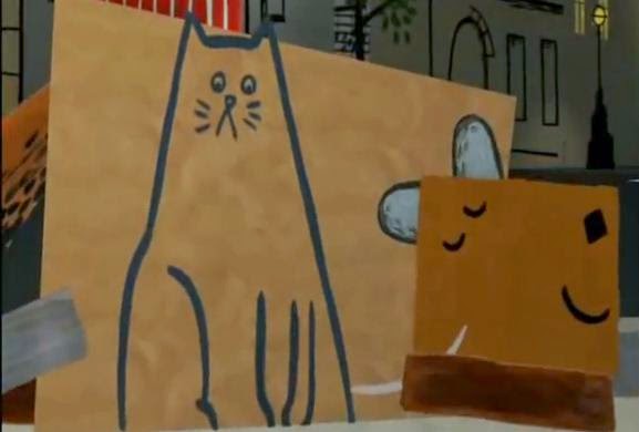
  • Cut out animation - could print onto acetate for each main frame and have a stationary watercolour background with sketchy like approach to the design of the movement
  • Merge traditional pose to pose, with media much like Ryan Larkins work with his walk cycle - make my own version
Narrative - talking about an avant garde artist in slight detail with movement
  • Animate the process of direct animation - could be animated digitally or traditional, but with detail of how some direct animations are made - example being Brakhage drawing onto film, and ideas of monoprint - drawing onto glass and recording the process of the line movement - drawing the frame and then rubbing it away and drawing over the top for the next frame for example the lion boy
  • Animating how an avant garde animator  for example Brakhage, looking into detail of how he is an avant gardist - what makes his work avant garde etc. 
I feel that the Experimental ideas fit the criteria of the brief more than the Narrative ideas, however I do like the "Animate the process of direct animation" idea as it would play like a how to guide, and it would be interesting with the layout and movement of text, would it be presented in a scrapbook form with the script forming on the page - the target audience would be aimed at a teenage audience through the step by step guide functionality of the animation.
In the Experimental ideas I liked the "merge traditional pose to pose, with media much like Ryan Larkins work with his walk cycle - make my own version" - this would allow me to take influence from my essay and create a walk cycle that merges and forms into another movement cycle, such as turning a head which could form into someone walking down a path.

If I were to take the walk cycle further, I could experiment with media with in the walk cycle, so that every 9 frames it would change into another media, ink into marker pen etc. I could change this further by changing the walk cycle into a different moment, such as a character twirling or jumping through a skipping rope. This would need to be made traditionally through the different media I would be working with, however I could end the walk cycle using digital media as it would class as another media.

I could develop this further taking more inspiration from Ryan Larkins work, through the use of negative space:

- the walk cycle could involve the character moving through a crowd, the people depicted differently to make the negative space character stand out more.
- Could adapt a twirl sequence into moving through a space but not being seen, manipulating the space around the character to portray that their is an identity there, using leaves or a disjointed perspective as the twirl would take place over the image.

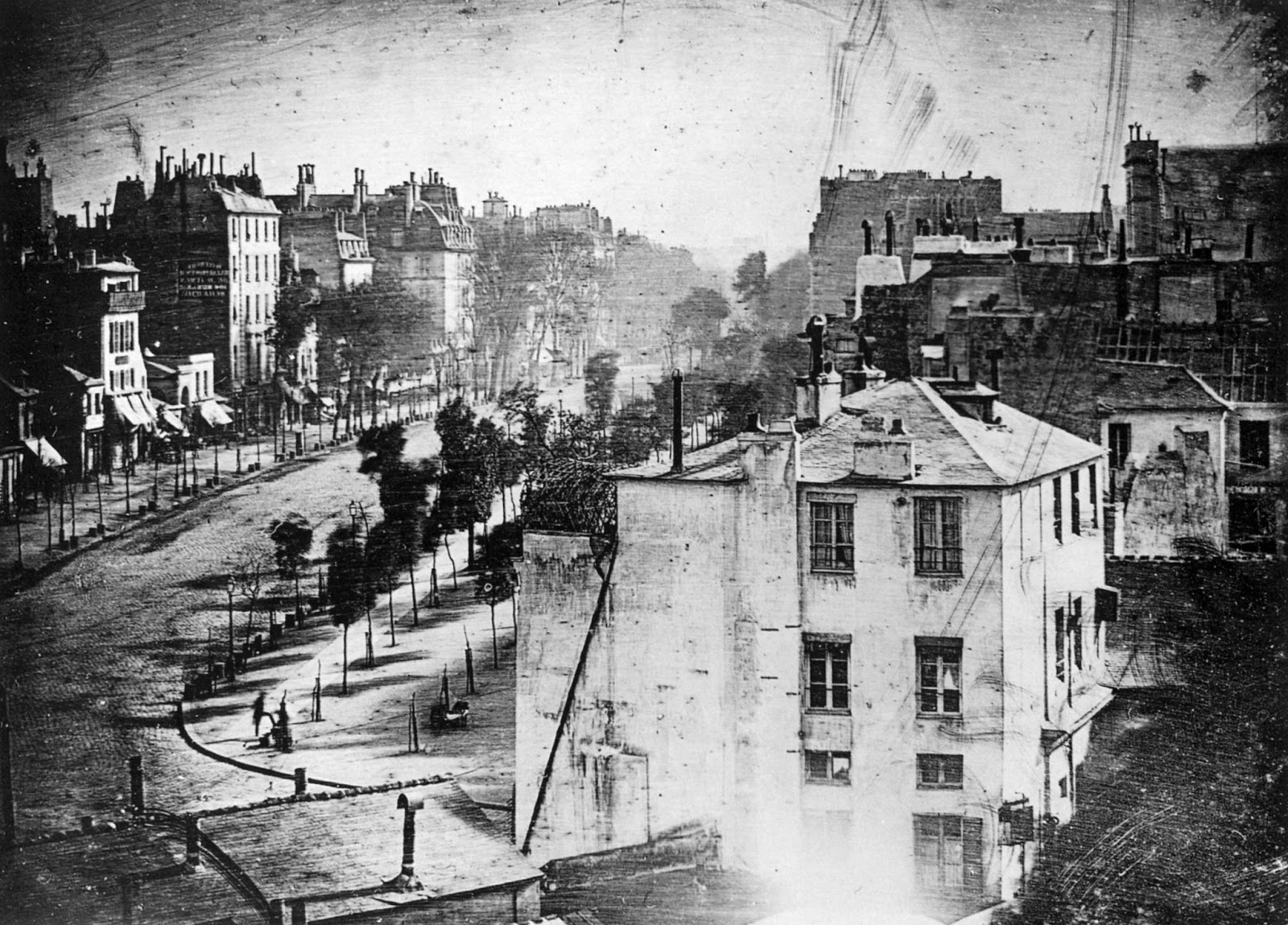
Another idea I could also develop from the other perspective with in avant garde in other art disciplines - for example in the 19th century, an impressionist painting would be depicted as a beautiful landscape and would be brought by a middle class consumer, to be mainly used as an object rather than for the aesthetics and for pure social status, when in reality the painting would actually portray a dodgy (red light) landscape.

Taking this idea I could show a peaceful landscape, for example streets with in a city or town, with people walking by to show how busy and filled with life it is, and as the sunlight slowly fades, we zoom into one of the windows, which shows gambling or violence to taint the picture.

I feel that the last idea would be interesting and different in portraying a part of the avant garde, as I felt it would be difficult to try and create something that is labelled avant garde with in such a short amount of time. With the last idea however, I would be able to portray a part of the rebellious streak that is shown in work with the purposefulness of misleading the middle class art buyer into buying something that is nothing more than an item to give them a higher status with in the environment.


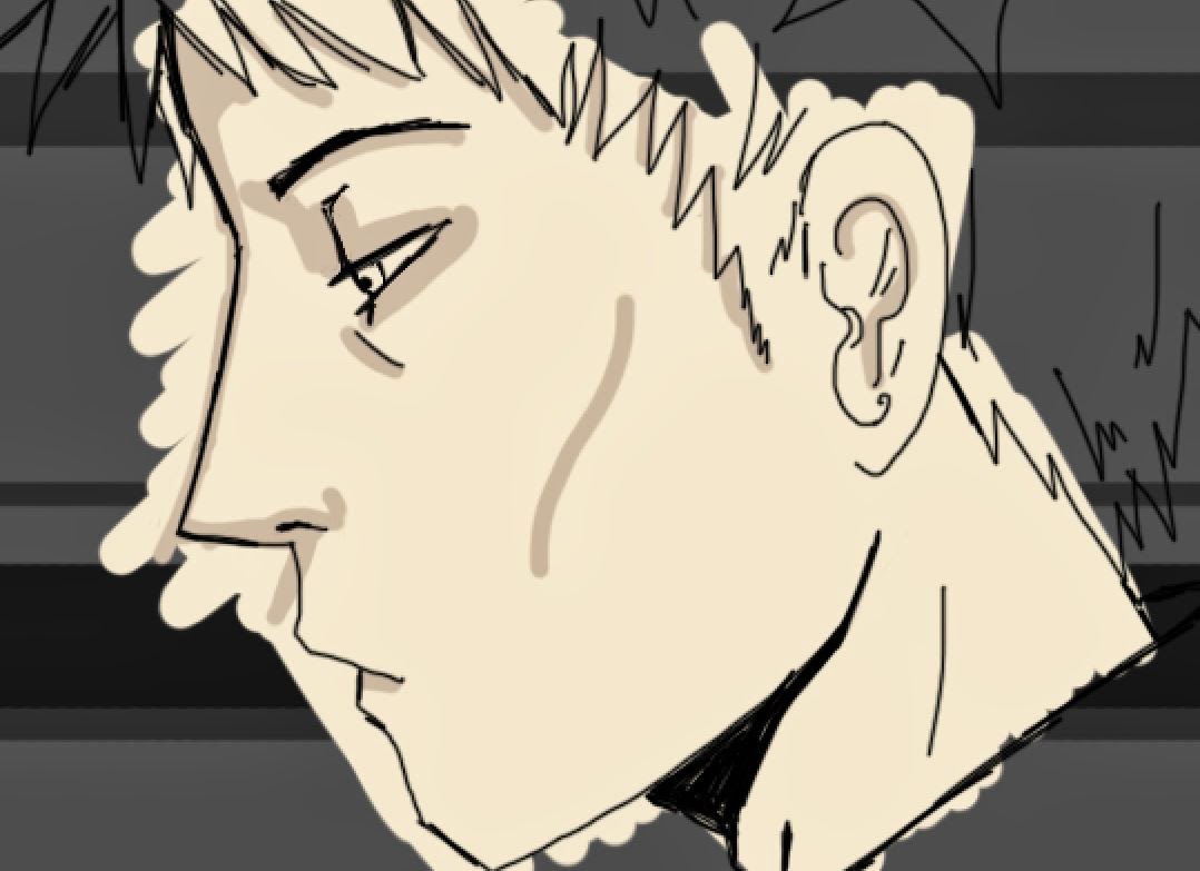
Rough sketch for the walk cycle idea, inspired by Larkin's Walking 

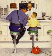
Thinking of ideas for the zoom in concept

Developing the zoom in idea, thinking about zooming into a window and
the image being blurry until we zoom in fully


Research for animation

For more inspiration I looked into other animations, I mainly looked into animations that involved a zoom in or out effect, to gain inspiration for my ideas for the final animation.

In this animation, I was inspired through the constant zoom in, that transitioned smoothly into the next scene, the figures were stationary but worked well with the camera panning. I used this as influence through the use of creating a bigger sized file compared to the frame size of the animation, so that there would not be a loss of information, making the image look pixelated as it zooms into the background.


Hook Up Animation / Zoom / Tv promo / Cartoon Network UK from Hook Up Animation on Vimeo.

This animation uses the same style as the previous zoom in however the camera spins to different directions and continues to zoom out as it reveals the title of the tv channel. There is more movement within this animation as the characters move as it zooms out compared to the previous animation which had stationary characters. I like this animation as it contains simple lineart and few colours which make it more engaging, if there were more colours I believe that the main point of the animation would have been lost and the aesthetics would have not been as pleasing. 


Spoon TV Ident 1 - Hemi Ormsby from Hemi Ormsby on Vimeo.

I stumbled across this animation in which another student has made for their project, on the history of Graphic Design. I liked how simple the animation was with the use of matte colours and shapes which moved with the animation, however I think that the animation needs to be slowed down as it runs too fast to be able to read the text. 


Wednesday 12 February 2014

Post Modernism and Post Mondernity notes


  • Modernism roughly from 1860 -1960
    With Post Modernism being from 1960 to today, though it is interpreted that Post Modernism is actually over already. 
  • Post Modernism is coined with architecture first, which hold minimalistic properties and a function.
    - It starts off as a reaction from Modernism, the only rule being there aren't any rules and it celebrates what might be considered Kitsch. ( Kitsch is another word for tacky or cheap looking)
  • Robert Venturi - his book 'Learning from Las Vegas' 1972 - His ideas developed with the aid of Charles Jencks, in which they both ended up creating a piece of architectural landscapes with Prince Charles.


  • Modernism - simplified aesthetic utopia ideals - truth to materials and form allows function
  • Post Modernism - Complexity - lies with its materials, tries to look like something else - Laced with humour and irony - Questions comments especially those set out by modernism - can be seen as tasteless.
  • Post Modernism aesthetic has a multiplicity of style as it approaches themes of 'double coding' 'borrowing' and quoting from a number of historical styles.

    "I like elements which are hybrid rather than "pure", compromising rather than "clean", distorted rather than "straight-forward", ambiguous rather than "articulated", perverse as well as impersonal...'
    - Robert Venturi


  •  Philp Johnson - Sony Plaza - the top of the building looks as if it has taken the top of a wardrobe and the bottom being from an art deco themed structure.
  • Archigram, group of students from the 1960s - 'Walking in New York' - the work never was realised. 
  • Pompidou Centre in Paris 1972, everything is colour coded, anything you would normally find inside, for example the escalator. It reminds me of an entanglement of wires through the different array of colours and shapes. 
  • James Stirling - Stuttgart, Germany 1977 - 1983. Its structure plays on the heritage, as it tries to trick the viewer that the museum is aged when it is actually new and made from cheap materials and disguised to look old. 
  • Product design - Kettle for Alessi 1985 by Michael Graves - takes the functionality of a normal camping kettle and refines, selling it for an expensive price, becomes a luxury item.


  • Philippe Starck, Juciy Salif - 1990, Form is arguably functional but more regarded for its aesthetics. 
  • Andy Warhol and Roy Lichtenstein - both use models or public icons and create art with the use of dots. Can be linked to Pop Art.
  • Jake and Dinos Chapman, Works from the Chapman family collection 2002. Meant to appear like traditional tribal statues, makes a parody out of culture.
  • Chris Ofili, first black artist to be recognised as one of the first young artists in Britain. He uses elephant dung to set up his work and incorporates it into his work. 'No women, No cry' was a piece that incorporated a murder victim Stephen Lawrence who was murdered with the police called racist for mishandling the case, his photo is seen in the tears of the woman portrayed on the canvas. 
  • Jean Michel Basquiat - untitled - one of the first black artists to be recognised 1981 - He looks at what it means to be a black american, trying to establish in Art society with a simplistic style that resembles one of a childs. It reminds me of Cy Twomlys work through how it uses colour, the space, the jaggedness of the line and how it looks as if it has been drawn on plaster.


Tuesday 11 February 2014

Print notes


If it is to print... then it is seen to be true
It is correct. It is factual

  • Print can be seen in the prehistoric age, Sumerian era in 3000BC where man would carve out a bone and blow animal blood over the top of their hand leaving a print of their hand on the walls.
  • Processes developed with in China through the creation of paper in 105AD by Ts'ai Lun. The paper was made by using the plant 'hemp', beating it into a pulp which would be mixed with water, drained through a cloth screen.
  • Japanese wood cuts emerged in the middle of the 18th century, known as Ukiyo-e.
    The process of woodcut used in the early stage of its development was argued to have used a process called 'Chiaroscuro' wood cut. This process involves the design to be separated into several blocks that each would print a different colour.
    Ukiyo-e translates to 'pictures of the floating world' or can be interpreted to mean 'common people' and 'picture'. It was thought that the prints portrayed the everyday life of a city called Kyoto.
    Ukiyo-e prints were first black and white, as the process adopted colour into the work, they became more popular and were made into pieces of work that were similar to postcards.
    As trades with the western world reopened in 1853, the movement 'Japonisme' was born, as famous artists such as Edgar Degas, Vincent Van Gogh, Mary Cassatt and Pierre Bonnard became inspired and absorbed elements into their work. Wood cuts can be linked to relief printing, other forms of print which link to this are Lino prints and Colliograph. Another process that can be linked also is Chine Colle. Chine Colle process begins with wetting the surface of india paper with water soluble paste and is cut to the exact size of the printing plate. This process is mainly used with in elements of collage and other printing techniques such as etching or lino cuts.

    Mary Cassatt
    Yuji Hiratsuka - Chine Colle
  •  The Gutenberg press, (Printing press, Letterpress) was created in 1452 by a German goldsmith, Gutenberg. This revolutionised the era through the publication of printed type. Typecasts were made through the use of hand carved woodcuts which developed into sturdier metal casts. Gutenberg also created an oil based ink to stick top the metal/wood moulds of type. The letterpress needed at least 20 people to help work the machine, change the woodcuts, change the paper etc. The letterpress was an expensive process and the first book it printed was a bible for the monks, in which they would slave most of their life making copies of the bible in such delicate detail whereas the letterpress was a far more efficient process to replicate the bible
  •  The amount of printed books rose to over 1,000,000,000 over the span of 3 years (to the 18th century). 
  • Mass Communication in Print, war propaganda, Russian Constructivism, Dada and even Pop art.
    Printed in digital means with in newspapers, magazines, billboards, flyers

Modernity and Modernism notes


"Modernism is the term used to describe the cultural expressions of modernity in relation to the experience of modernity. "

  • In design, it was agreed that design should not be illusionary or create false impressions.
  • Modernists embraced the advancement of technology. 
  • The main idea/purpose of the art was that it was functional, "Form Follows Function". 
  • With the aftermath of World War I, modernism took an optimistic approach to society, through the thought that this tragedy would not happen again.
  • For a modernist it was appealing to make the art form one which would be instantly recognised, an iconic composition to an international audience. This international point of view was formed through how World War I brought countries together. It is also suggested that modernists held a belief that their art could change the way people think.
  • It can be seen that modernism was adopted as if it was a religion, as it constituted a set of beliefs, making people believe they were living in a 'new age'.
There are two distinct concepts, Modernity and Modernism.
  • Modernity - Uses the latest processes and techniques ensuring to be contemporary and up to date, and has the quality of being modern.
  • Modernism - an early to mid twentieth century movement in all aspects of the arts. 
"Arguably, the process of modernisation allowed Modernism to develop and flourish"
  • Pre-modernity - world governed by the church, Monarchy and Patriarchy.
  • This form of influence lead to structures such as the Piazza San Pietro, Rome, which was created by Gian Loreno Benini in 1655-57.
  • In the late 18th century it was regarded that the Industrial Revolution was seen to have begun with Thomas Telford's Ironbridge in 1789. The Industrial Revolution is suggested to have fully taken place during the 1830s in which the development of factories, transport, canals and railways were absorbed into the culture. Here we see the emergence of the working class.
The age of Enlightenment was the dawn of modern research, philosophy and science which took place during the late 18th century. The most part of this movement was the writers and thinkers, for example Denis Diderot who created the first Encyclopedia. This movement was seen through some of the pieces of these artists:
  • Rembrant Van Rijn -  A pioneer in art as we know it, he is famous for his experimentation in print making techniques etching and engraving. He was considered to be the Baroque graphic master.
    In his piece, The Anatomy lecture of Dr Nicolas Tulp, we see the recordings of a scientific event, research into the anatomy of the human body.


  •  Joseph Wright - Experiment with an air pump (1768)
  • Important key dates: (1751 – 72) publication of Diderot’s Encyclopedia, (1776) American Declaration of Independence, (1789) French Revolution, (1804) Napoleon crowned Emperor, (1814) Bourbon Restoration, (1830) July Revolution (France).
  • Modernism was the process of rationalisation, secularisation and democratisation. This can be seen through the works of Eugene Delacroix Liberty leading the people 28th of July, which shows the spirit of the revolution.
  • This piece was the earliest and permanent surviving photograph taken, that used the process of lithography and took several hours to dry. A few years after which, Louis Daguerre created his famous piece Boulevard du Temple in 1839, his photograph took ten minutes to produce and is the earliest known photograph to contain imagery of people. This daguerreotype revolutionised the world, with this new form of capturing an image.

    'The first photograph' - Joseph Nicephore Niepce, View from the Window at Le Gras 1826

    Louis Daguerre - Boulevard du Temple 1839
  • Edvard Munch's piece, Evening on Karl Johann, shows the alienation and relationship between the figure and the crowd, him against the world.
 'In or about December 1910, human character changed'  - Virgina Woolf 1924

With the introduction of cubism and futurism, the form of objects and human beings drastically changed, it became more abstract and focus on different ways to portray something but still being able to recognise what the object is.
  • Pablo Picasso was a pioneer with in Cubism which can be recognised through the angular lines and shapes used with in the compositions. 
  • Umberto Boccioni was a pioneer with in Futurism through the documentation of kinetic energy.
  • Marcel Duchamp changed the way we perceive art with his piece, "Fountain" 1917. He questioned what value art had, was it the urinal he had used or the signature on it that made it valuable? It was of course his signature, his signature can be argued to be the art itself however I like to see this piece as something that changed the view of the public, something that inspired so many artists to create work, an iconic piece.


  • In design and architecture, modernism has various ‘rules’, form follows function and truth to materials. It leads to a minimalistic aesthetic and is best represented by Bauhaus which often has a moral seriousness, priding itself with high quality aesthetics.
  • With new technology, pieces could be created in mass production, meaning that expenses were cheaper with each product being demanded by the consumer.
We see that modernism started with a Utopian defiance towards War, an optimistic approach to anti war and aims to absorb and use new technology to benefit rather than discard it.