Friday 6 December 2013

Illustration

An interpretation of illustration is that it is strategic form of image making, used within context of visual communication to convey meaning or concept. The earliest form of illustration can be linked with the beginning of written communication seen in cuneiform carvings.

In my opinion, illustration means to be different, to have a unique perspective of your surrounding environment, views on political and social contexts, something personal to you.

James Jean -  A beautiful mixed media illustrator that incorporates fantasy based themes with in his compositions. The attention to detail is breath taking with his control of line and blend of acrylic paints which create a surreal scenario in which his figures and environments emit this delicate atmosphere. Jean's work inspires my own work through how he portrays his surroundings and twists this into his own surreal depiction, his work heavily influenced me whilst I was creating a more experimental outlook on the Visual Language task of Set, Series and Sequence.

untitled
Marc Aspinall - Creates work that holds a lack of direct solid black outlines and instead replaces it with a gorgeous digital painted portrayal that feels heavily concept art based but depicts a story through the expression and angle of the compositions.

Broadchurch

Tomer Hanuka - A digital based illustrator who creates his work in a detailed and stunning approach. Hanuka is an illustrator who has inspired my work throughout my time at Selby College and still does. I believe his work inspires me so much as it not only incorporates detail but it absorbs such emotional and contextual expressions that it makes the composition that much more meaningful.


Emotional impact  = graphic story telling


Vania Zouravliov - A beautiful human being who creates just aesthetically stunning traditional illustrations that have made a huge impact on my work for many years. Zouravliov's work just continues to inspire me through how he captures so much detail, how he depicts the detail with media and how the placement/structure of the composition changes the outlook of the expression and body language of the character portrayed.


Edward Ardizzone began his illustrative work with the Little Tim series that held a beautiful sketchy, watercoloured appeal which worked well with the younger audience target market. I just find the appeal of the dip pen strokes aesthetically pleasing to the eyes.
Ardizzone was then known as the official British war artist, and created sketches detailing the journey in which the troops endured. These compositions which Ardizzone created contrasted drastically with the Little Tim illustrations, with the complete change in colour palette, contorting into greys, blacks, and desaturated blues, giving the imagery a deep atmosphere of despair, dread and foreboding.

Sicily

Little Tim

I believe illustration is a form of escapism, a form which allows the illustrator to create compositions that don't have to relate to reality, or ones which do relate to reality but in their own portrayal, its a from of expressive freedom that can hold so much meaning and context that it can make the audience bewildered and conjure different takes on the composition.


Wednesday 4 December 2013

Auteurship and the Avant-Garde

The Auteur theory suggest that great film directors are artists in their own right on the same page as great novelists. (It is associated with French critic Andre Bazin and writers for cahiers du cinema in 1950s). It suggests that films made by a true auteur display thematic consistency and artistic development through time, for example Hitchcock.

Truffaut - A tendency in 'French Cinema' 1954, it attacks french tradition in which the director is seen as simply adding images to pre-existing literacy scenarios. ( a non cultural industry, individual and unpredictable).


"An auteurist director was recognised as having a unique signatory across a canon of work, that holds an aesthetic and thematic terrain, and offers a coherent view of the discourses fundamental to its understanding and art"
- Quote from Paul Wells, Animation Genre and Authorship - Page 72


Auteur theory in animation
notes
Animation echoes and imitates large scale film production and can also offer the possibility for a film maker to operate almost entirely alone. (Arguably it is the most auteurist of film practices)
Collaborations require cohesive intervention of an authorial presence however few animators lauded as auteur's in relation to feature length animations. So merged within a corporate identity such as Disney.

Disney is a key figure in the animation world through the creation of its animations and is seen as a epitome of the American Dream.
With arrival of Mickey Mouse, Disney withdrew from animating to organise the establishment. Disney Studio's is an ideal of overall ownership and vision but it is at the expense of the lack of recognition of the actual animators; the animators work not being seen through the constant animation style of Disney.
Disney began to retell fairy tales and other stories which belonged to someone else, such as Alice in Wonderland originally created by Lewis Carroll, the original author is lost and all focus on Disney.
A few more examples of this can be seen in the Disney films, Little Mermaid, Winnie the Pooh and Pinocchio.

The Avant-Garde, a french term derived from a selection of an army that marched into battle ahead of the main body of troops. Both the English and the French use this to describe pioneering and innovating trends in the arts, especially in visual arts and music.

Tuesday 3 December 2013

Animation Chronology part 2

In 1928, animation developed enough to become commercial in advertising. Animation was no longer regarded an art but more for commercial purposes, cartoons had become more popular, they had become mainstream.

Walt Disney was the man who kick started the commercial purpose of animations, this can be seen in his early work such as the 'Skeleton Dance' and 'Steam Boat Willie'.
The Skeleton Dance was quite unique as Disney created the video as a response to the music that was played, it could be regarded as one of the first music videos.


Aleksandr Ptushko's Novyy Gulliver also known as the new Gulliver was an entire stop motion mixed with live action, film created in 1929 that used tracking shots.

Ladislaw Starewicz created stop motion animations such as the tale of the fox in 1930, which took 10 years to make. The animation is beautiful through how smooth the movements of the characters are and needs to be considered as a work of art.


Many animators find Starewicz's work influential and have created their own take on his work, creating their own interpretation.

Max Fleischer created cartoons such as Betty Boop and Pop eye using a traditional pose to pose process, however Betty Boo was an outrageous character through the suggestions of the character taking drugs and nudity that was incorporated into the animation, which was eventually censored. The animation style however shuddered at places through a few transitions of movement.


Willis O'Brien created the stop motion King Kong which is considered to be one of the most defining moments of film. It has been remade and interpreted many times and is a huge inspiration for many animators and film makers.

In 1935, Oskat Fischinger created the animation named 'Komposition in Blau' which used mix media to portray the contextual background and atmosphere of the piece. The art of the animation was persuaded by Nazis and was regarded as pathetic and degenerate. Fischinger didn't agree with the Nazi belief and moved to America where he was welcomed and worked for Disney.

Len lye created an animation named 'Colour Box' in 1935-36 which incorporated different media and he spent his entire life trying to animate movement. With in his work he used direct animation which involved the artist to directly create each frame as he then filmed it. He was known for his postal service advertisement which became dynamic and responsive to the work ethics of the postal service.

In 1937 Disney created Snow White and the Seven Dwarfs, one of his first big budget films that had over 1000 people working on it and spent over $1,000,000 on costs. The main animation technique used was rotoscoping, which an animator trace movement and footage, frame by frame.


Animation Chronology part 1

The word 'Animation' is derived from the Latin 'animare' meaning 'to give life to'. I think this is an accurate way to describe animation as a whole, through how animators not only make imagery move, but tell stories in which bring this imagery to life.

Animation requires an individual to create a series of images that give an illusion of life, a perception. They tell stories and events that have been illustrated sequentially for thousands of years, evidence of which can be seen as early as cuneiform on cave walls and hieroglyphics in Egyptian burial chambers.

The animation can be argued to be seen to develop from the Magic Lantern invented by Christian Huygens in 1650 - The first projector that projected an image via candle light.


In my opinion the Thaumatrope can be seen as one of the first moving images through the illusion of both sides of the toy merging together. The Thaumatrope was invented in 1824 which was patented by John Paris.


The Phenakistoscope was invented in 1831 by Plateau and Von Stampfer create individually in different countries. The device uses a circular plate which has more than one image drawn on it, and when the device spins, the imagery merges and creates a moving image. This device relies on the 'Persistance of Vison' to create an illusion of movement, an interpretation of an optical illusion.


The Zoetrope was invented in 1834 in England by William Horner which he initially named the invention "Daedalum", however it did not become popular until the 1860's when it was patented by both England and America. William F. Lincoln developed this and named it the "Zoetrope", which means the 'Wheel of Life'.
(http://www.exeter.ac.uk/bdc/young_bdc/animation/animation4.htm)


The Zoetrope images would be drawn on a strip and presented in a circular shape that would spin and have slits on the circular shape, which the viewer would look through to see the movement of the image.
The Praxinoscope projects images presented in a device similar to the Zoetrope, however it uses mirrors and a lever to rotate the circular drum.
(http://www.exeter.ac.uk/bdc/young_bdc/animation/animation5.htm)


The Kineograph or Flipbook 1868 patented by Joh Barnes Linnett of London to sell. The images would move by the person flipping through the pages, causing the imagery to move. I believe that this was developed further into the device Kinetoscope, which was created by Thomas Edison with images recorded in wax cylinders of film, and the viewer would look into a box to view the film. A predessor of this was a form of entertainment, where a flipbook like process of images would move once you rotated the handle of the box, these would contain humourous scenarios and be found mainly at coast lines where mass amounts of tourists would visit, seaside.


"Animation is not the art of drawings that move but the art of the movements that are drawn."

Norman Mclaren 1914 - 1987


Georges Méliès was a famous and the most influential experimental film maker who merged animation with film. He was most famous for his film "A trip to the Moon" in 1902.
This film is referenced in "Hugo" which is very influential through the incorporation of the atmosphere of that era and the technology of that time.


Personally I find this film very inspiring through the lack of technology and the amount of time that this must have taken for completion. This film would have used numerous amounts of staging and props with heavy lighting equipment and cameras. I also found it interesting that the actual film reel was then painted to introduce colour to the video.


In 1908 Emile Cohl created the film Fantasmagorie which was regarded as one of the modern animations. The animation was primitive with the use of the line and composition however the movement and change into different shapes within the animation worked really well and flowed smoothly.


Windsor McCay created the animation Gertie the Dinosaur in 1914 which used the process of Pose to Pose, it was quite primitive in appearance however it was the first animation that used key framing and registration marks to keep each image flowing into the next. The animation is jagged in places however to say that the animation was created before the advancement in technology, this piece is a huge inspiration.


Tuesday 12 November 2013

Type Production and Distribution


"Type is what Language looks like" 
Thinking with type, Ellen Lupton


The first alphabet that we can trace back is to the Greek alphabet, adopted from Phoenician, and is arguably the foundations for todays alphabets in other cultures. We can trace back the start of written communication to Cuneiform which was developed from Mesopotamian.

  • Johannes Gutenberg
    Invented the Gutenberg Letter Press which incorporated the use of metal cast type and was printed the first printed body of text, a bible, which was commissioned the Church. This was an revolutionary invention, through the aid of being able to print more than one copy of text, and not having to rewrite documents to create more than one. This was especially needed for monks as most spent their lives creating the bible, adding imagery and using blackletter.
  • William Foster - 1870
    Brought forward elementary education act, the law to be taught to read and write. It wasn't just a luxury for rich people anymore and became a dramatic change for class. This gave so much more opportunities for the working class, more jobs and to be more creative.
  • 1919 - Walter Gropius
    Lead to the beginning of Bauhaus (1919 -1933)
    It made artists think about the function of the art and product which would drive the form.
  • 1957 - Max Miedinger
    Created Helvetica  which is used for advertising and can be said to define modernism.
    The type form is neutral and the purpose of what it was designed for drove the type more than any before. (25 years later Arial was released, which was created by Microsoft and holds similarities to Helvetica).
  • 1990 - Steve jobs created the Apple mac - October 15th 1990 the 1st apple mac was released to sell for less than $1000 - this wasn't the first computer but it was the 1st time that working class could buy and use these, not inclusive for the rich.

    Type describes the theme of a product, it portrays the identity of the design.
    For example, the type Gotham is seen as masculine and powerful as it was the typeface used for Obama's campaign. It is now also used for advertising, companies such as McDonald's and Starbucks have used this for the same reasons as the Obama campaign, to show power.

    Type becomes an image in its own right
  • 1990 - Tim Bernes - Lee created the Internet and first idea for a browser and gave it away for free.
  • 1994 - Vincent Connare created comic sans and worked for Microsoft.
  • 1995 - Bill Gates - invented/brought in the search engine, Internet explorer which uses mainly Arial and Comic Sans type. Certain set of type, formats, dictated by a set of people. 
     
 
Typography is Communication


"There is no single approach within typography that applies to everything"
- Shelley Gruendler.


Genre in Animation


Genre is a classification of film that is there for the audience to be aware of what the film is, for example a horror wouldn't be suitable for a five year old. There are many types of genre, such as horror, drama, comedy and action, and these can be merged, a cross genre, such as a dark humour.
Genre is very stereotypical and it needs to be, to be able to label what the film is based on, such as a romance is linked with females whereas action is matched with males.

Animation allows much more stronger violence with less graphic scenes, for example, an Anvil hits someone on the head. In an earlier era, this is portrayed, in animation as a cartoony design, the stronger violence can be tolerated as it is a clear form of fantasy and does not depict reality. (Examples of these cartoons are Tom and Jerry, and Looney Tunes.) However due to changes in society, there is hardly any violence in cartoons for kids, for fear of repetition of the actions portrayed.


The violence portrayed in the Tom and Jerry videos seem not to be shocking through the use of the cartoon style of the animation, however if it had been more realistic with added gore then it would not be suitable for a young audience. The character 'Tom' appears scary, through the use of shadow and expression on the cats face which is done very well as it portrays the mad scientist and the devious intent to catch the mouse, Jerry.
The storyline of Tom and Jerry is easy to notice, Cat verses Mouse, with the mouse always winning. This is done to make the cartoon appeal more to kids, showing a small character win over a towering villain, makes the victory that much more exciting.

Generic Plots - in animation

  • Maturation - coming of age/ rite of passage
  • Redemption - transition of main character from bad to good
  • Punitive - main, ostensibly good character behaves badly and is punished
  • Testing - willpower verses temptation
  • Education - main character moves from negative to positive perception of the world
  • Disillusionment - the reverse of education, from positive to negative perception


Visual Literacy - The Language of Design

Seminar Notes -

Visual Literacy is a communication structure, meaning and context to different target audiences, and a range of different cultures. For example the use of colour alone can completely change the meaning of a piece, such as using a red hue to change an image from a happy atmosphere to one of anger and rage. This communication becomes a message to the audience that is informative and relies on the ability of interpretation of the viewer and the presentation of the image.
Another example of how visual language changes through colour and composition can be seen in the first aid cross, to the European flags through mere manipulation of lines in the cross and the colour of the composition.


England


Sweden


Visual Language is done with a purpose, a purpose to attract a certain age range, to emit a certain atmosphere, to make you think, and is done so based on a level of knowledge and understanding of symbols, gestures and objects. For example well known symbols such as a boy and a girl are used to show which is the male and the female toilets, added with a blue colour for the male and a pink colour for the girl. It becomes a universal knowledge of what these symbols mean, so if you were in a different country and did not know the language, you would still be able to depict which toilet is for which gender.

Visual communication is an unwritten agreement between any language or culture, where one thing will stand for another. This can be seen as far back to the Cuneiform carvings in stone, ( dated back to about 3000 B.C.E )


Visual Literacy can be divided into two parts, syntax and semantics:
  • Syntax - The structure of pictorial elements, such as the scale, colour, simplification, any visual aspects of an image.
  • Semantics - The contextual and cultural references, social ideals, religious or political ideas, iconic and historical structures.
Semiotics - is a visual metaphor

Semiotics is the study of signs and sign processes, indication, designation, analogy, metaphor, symbolism, signification and communication. This is closely related to the fields of linguistics and studies of structure and meaning.

Wednesday 23 October 2013

Ersatz (Surogat) - Zagreb Film 1961 - Dusan Vukotic and the comparison of the hand


Vukotic creates this animation through the use of traditional animation (cel animation), which works well with the cartoony stylised illustrations used with in the video. The animation contains simple geometric and triangular shapes, in which the main character of the video uses to create other characters or objects whilst at the beach, for example, the car, shark and BBQ.

I felt that the main purpose of this video was to entertain the main older audience. I feel that a younger audience would not be suitable for this video, as the plot of the animation doesn't include any repetition in which the audience could better understand the objective.

The entertainment of the video can be seen through the comedy values of the piece, such as the shark turning against the main character, which was an attempt to get the woman to fall for him but backfires.

Still from video 1
- Summary of Plot -
The main character enjoys a day at the beach, catching a fish for his lunch, however he gets lonely and creates a woman. He tries to get the woman to fall for him, by making a dangerous situation in which he could save her from, in this case he created a shark and had it swim after her in the sea. He saves her but to his disappointment, she spots a muscly man and runs for him.
- End -

The plot of the animation was very interesting through how the main character made objects, including his car, BBQ, towels and even other characters through the use of air into balloons, which formed triangular or geometric shapes beforehand. I loved the ending, in which a nail 'pops' the main character and we find out that he too is a balloon and he deflates, which left me with questions. If he was the creator of the balloon woman, then who was the creator of him?

Still from video 2

The illustrative style of the animation, with the block colours and line variation, reminded me of the work from Hanna Barbera. For example the animations of Yogi Bear and Pink Panther. I felt that the line and even the movement of the characters in Vukotic just reminded me of the Barbera animations, the humour and also the exaggerated movements that entwine with the characters personality. The main difference between the animations of Hanna Barbera and Vukotic's is that of the main target audience, Barbera being for a young audience and Vukotic's being a slightly older audience.


Yogi bear cereal advert - 1960s


Pink Panther

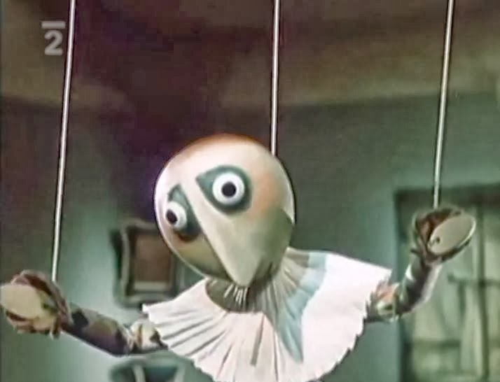
In about the same time as this video, The Hand by Jin Trnk, in which a puppet is forced against his will by a Hand, which I believe symbolised the dominance and superiority of the Nazis in WW2, the puppet sculptor caged and made to create this sculpture for the Hand. The Puppet manages to escape and unfortunately dies an ironic death as the thing he cherishes the most ends up being the end of him, his beloved flower pot.


The animation style of both of the videos differed, through the modelling and stop motion of 'the hand' and the traditional cel animation of Surogat. I felt that both of the animations styles used worked well with the plot of the videos, for example with "The Hand", the modelling and stop motion seems to make the audience grow attached to the puppet, whereas the "Surogat" uses cel animation which connects to the audience immediately with thoughts of entertainment and comedy, just through the line and colour used.

The background context of both animations blend into each other, through the aftermath of WW2, the cold war, and the great depression. I felt that the Surogat animation wanted to be entertaining to lift peoples spirits up from the devastation of the great depression, which left families homeless, the lack of jobs and the heightened mass amount of the unemployed. The animation was much like an aid for an escape from reality.


Watch "Ersatz (Surogat)" on video above


Watch another example of Dusan Vukotic's work, Osvetnik on the video above


Friday 18 October 2013

Animation - Jiri Trnka - The Hand 1965

In this animation, Trnka uses model and film to create his work which is engulfed in a dark mix of context, with the height of the cold war, the repression of the art practice and 20 years after WW2. In this video it shows clear superiority from the Hand, which I believe represents the Nazi's rein through how violent and manipulating the Hand became after the puppet sculptor refused to make work for it. The symbolisation of how the Hand manipulated and controlled the puppet, much like a puppeteer, was brilliantly portrayed, as it showed how the puppet was forced against his will, caged and made to create this sculpture.


Still from animation

Still from animation

Near the ending of the video, it became quite ironic, through what he loved the most, his potted plant, ended up killing him. After the puppets death, the Hand gives him a burial, surrounded in propaganda in which the puppet had no belief or want in, that makes me feel that, in a way, he is being disrespected with the only escape of this propaganda is in death. As morbid as my opinion sounds, I believe this is among the main underlying meaning, through the horror of Adolf's rein and torture of his superiority.


'Adolf  the Super man' - John Heartfield - photomontage
Throughout watching the video, I couldn't help but be reminded of John Heartfields work, in which he too made imagery that showed the suffocating manipulation and greed of the Nazi's, but he also made mockery of these figures with in his work. For example in the piece "Adolf the Superman", he uses photomontage to his advantage, including x-rays, to show the money with in his stomach, symbolising greed, with the Nazi symbol as his heart to symbolise his thirst for power and dominance. Even the title of the piece, makes the piece surreal.


Wednesday 16 October 2013

Illustration - Norman Rockwell


Norman Rockwell was an American illustrator who obtained a realism based style with his own twist through the expressions and body language of his designs. Rockwell's work was so influential with his illustrations, to the point of debate whether or not Rockwell was an icon of the 20th century. His illustrations are beautifully made, through his use of colour and painted media, which gives a soft and realistic edge to his work and makes you clearly see how time consuming his work must have taken. Rockwell's work can be interpreted to be avant-garde, an artist who is innovative and includes themes of political and cultural context.

Freedom from want, 1943

This can be seen through these propaganda posters that were created during the second World War, propaganda that was made to make America feel at ease and remember what they were fighting for. Rockwell created imagery that reminded the public of the comforting American lifestyle, for example one of the posters depicts a family sitting down to a thanksgiving meal, every face smiling to show the audience what a good time it is with family, with the caption "freedom from want". This poster is matched with another three, "Freedom from Fear", "Freedom of Speech" and "Freedom of Worship", all of these posters aimed against the rise of war. These images became almost an delusional identity for American life through out the duration of both the great Depression and WW2.


After Prom photography reference


After Prom

It was interesting to see the difference with in the photography reference and the finalised illustration. I could see the small changes that he had made to the illustration, for example, the expression and body language of the chef/waiter as he leans in towards the flower, the position of his arm was bent, making the movement of him leaning in to smell the flower more fluid and less ridged. The body language of the two characters before the man, have changed also, through the slight position of the boy's arms and the angle of the girl as she shows the man the flower she has been given. These slight changes from the main reference works well within the illustration as it not only contains Rockwell's twist on his realistic style, but makes the design, in whole, more animated.


Rockwell's work is interpreted to be one of the last illustrators of the era, when artists and advertising were reliant of the illustrator for key ideas, however through the rise of contemporary art and modernism there has been a decline in illustration. I believe this is due to the advancement of technology, leading to computer generated illustrations and graphic design, and the process of photomontage, which has seemed to have engulfed most of traditional illustrators, much like Rockwell's work.


Image reference for Normal Rockwell and Quote:
http://onlinebrowsing.blogspot.co.uk/2012/03/norman-rockwell-it-wouldnt-be-right-for.html

References:
http://underpaintings.blogspot.co.uk/2013/05/random-inspiration-norman-rockwell.html
Context of Practice lecture notes 

Tuesday 15 October 2013

Photography - Mass Observation

Mass Observation was a movement in 1937, thats sole purpose was to document and study British behaviour.  (The main founders being - Tom Harrison, Humphrey Jennings, Charles Madge and Humphrey Spender.)   Humphrey Spender was known for his photography within the work town project, the photography being judged through a theme of difference between the working and the upper class. Spender and other photographers within this group would train from London to Bolton to document the working classes way of life. I find this quite interesting through how the Mass Observation group, filled with the rich upper class would take it upon themselves to document the working class. It seems odd, through how this can be taken harshly with the thoughts of snobbery due to documenting a poorer community from the one in which they came from.


http://www.massobs.org.uk/images/content/boltonpub.jpg
Worktown Project - Bolton


The photography taken is interesting through its' composition and contrast of the black and white image. The use of the foreground of the dogs and the background of the content of the bar, gives the image a sense gradual depth but also how small the area is, in which the people have gathered in to get a pint.
The expressions of the men at the table are quite irritated through one of the mans glance with his body posture, as if to say, "thats enough now". On this table, we are not able to see the third mans face, however we are able to see with in the mirror in the background. Whether this was deliberate or not, it adds to the image. I feel that this creates an atmosphere of alienation in the sense of his body language and the angle of reflection with in the mirror.

The worktown project reminded me of Robert Doisneau's work, for example his "Les Animaux Superieurs" photograph containing a crowd surrounding a trapped monkey with a lead around its neck. (Doisneau's work is well known in France, with a series of postcards containing the most iconic pieces. His iconic images are known to refer to modern society, showing images that would be acceptable in the past and not in the present. For example, kids playing on the road until dark, this would not happen today as society has changed and there are more dangers for parents to worry about.)


Robert Doisneau - Les animaux superieurs 

This image holds a strong thought provoking theme, of  "which is the animal?". The crowd in this image act like flies as they try to get closer to the tied up monkey, a sense of entertainment for the crowd. The images main portrayal is the cruelty towards the monkey which is brilliantly displayed through the gathering of the crowd and the expression of the monkey's face, the outfit placed on the monkey gives off an atmosphere of a sadistic nature, through how the 'Owner' has made the monkey more interesting by adding a costume. It shows how different entertainment was in the 1930s, during the great depression which cost a tidal wave of countless lack of jobs and homes for millions of people worldwide. The great depression just hit before the start of Hitlers rise to power, and the commence of WW2.


references
Context of Practice Lecture notes
http://blog.ricecracker.net/tag/robert-doisneau/

Sunday 13 October 2013

Introduction to Context of Practice Lectures

For the first Context of Practice Lectures, I was given a short introduction into different art disciplines and media, such as photography, animation, illustration and typography. The lecture also gave a summarised contextual background to the work and discipline shown on the slide which was interesting to see how much that influenced the work itself. Over the next few blogs, I will be researching more into the topics shown at the lecture presentation.