Thursday 14 January 2016

COP3 Practical - Final Storyboards


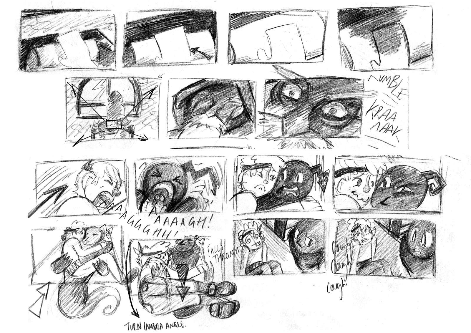
For my final practical outcome, I merged the premise, character designs, thumbnail boards and final storyboards together to create a finished book of work. This finished book shows how the visual storytelling has traveled from the premise and continued through each composition drawn. It shows how the development thumbnails have combined together to create an innovative approach to the composition in my storyboards, a merged perspective.

My practical outcome has changed considerably throughout this module, however this was always due to learning methods and techniques of manipulation in composition whilst writing my dissertation. This is how the animatic side to the practical was never continued, I debated this for awhile and the inclusion of the animatic was not needed as it didn't show a strong synthesis. An animatic would have been fantastic to show the movement of the camera angle and a parallax of the primary planes however it would not have worked with my core question as well as finished storyboards. Whilst discussing my practical outcome in my last tutorial, an idea of including quotes within the pages of the final storyboards was given. I quite liked this idea but I wasn't entirely sure if it would work well, the quotes from my dissertation are from theorists arguments about realism or from describing the concept of Screen Mirror. However I added these quotes in the boards and it not only worked aesthetically, it brought that academic approach to practical, creating a beautiful link between both pieces of work. I loved the look of it and it did read well with the storyboards compared to my original thoughts. 

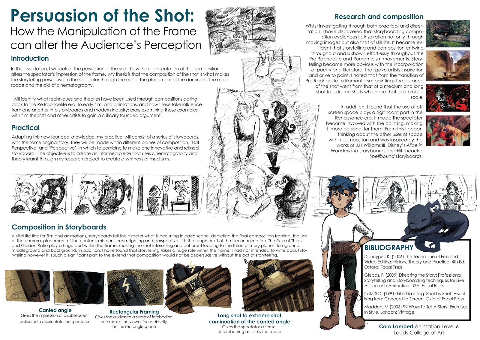
The finished storyboards show my approach to the methods, film language and techniques that I have analysed throughout my dissertation. I have thoroughly enjoyed this project as it has allowed me to create refined storyboards for a portfolio of work, it has given me the opportunity to learn and improve my knowledge of film language and composition, how the importance is vital for a storyboard artist.  

COP3 - Revised Academic Poster

I updated my academic poster with final images from my practical storyboards and a conclusion that merged with both my practical and dissertation. I wanted to create another board to visually show how much my practical has grown along with the dissertation. I prefer the layout of this poster than the previous, it looks neater and has a finished approach with the completed panels on the page. Whereas the previous poster contains the thumbnail sketches that worked for a development poster rather than a conclusive one.

Creating this board reassured me with what I have achieved over the module, and how much I have learnt through all this research and analysis undertaken. When I created the first board I was very unsure about my practical work with the ending outcome being an animatic, I couldn't see how an animatic would be beneficial towards my work. However with this edited poster I feel more confidence with the practical work that I have produced, the storyboards not only work with my findings and new knowledge, they are great for my portfolio. 


Concluding Academic Poster
Development Academic Poster

COP3 Practical - making Final Storyboards

Whilst creating the storyboards there were times when perspective became a problem. In order to solve the problem I went straight to primary photography, this was mainly for the proportion of the Hero character, or if it was more of an architectural problem I would quickly use Maya for reference. Maya was fantastic for creating a simple and fast version of the background that I wanted to draw.

I ended up only using Maya for reference on two scenes, one contained the main interior of the Tower and the other a tilted shot of the Tower. I first tried to tackle drawing the Tower from the exterior at a canted angle with the use of three point perspective however the cone shape was frustrating. I just could not draw this cone shape in three point, if the Tower had been a square shape I would have easily have drawn the perspective.

To solve this problem with the Tower, I created an extremely basic scene in Maya, colouring the door and window with bright hues so they didn't blend in with the rest of the environment. I didn't spend too much time on modelling this Tower as I only needed this for reference in which I would be adding detail on the storyboard panel. This reference helped me so much not only with drawing the cone but it also pointed out where I went wrong with the three point perspective. I placed my guidelines over the Maya reference and noted where the base of the cone should have been curved. I will definitely be using Maya as a reference tool more often in my work.


Example of Basic Maya Layout
An attempt at three point with a cone shaped building

Extremely basic Maya reference

Use of Maya screen shot to final image.


COP3 - Feedback from Arcus Studio, James Taylor & the Final Storyboard Layout

After completing my thumbnails for the merged perspective boards, I sent them to James, from Arcus Studio, for some feedback on the process so far and some screen shots from one of his projects for my dissertation. James's feedback was positive and really helped me with proving the thumbnails for the final boards, as well as reassuring that the use of film language was good within the boards.

I will definitely be reading the Dream Worlds book, from the research that I have completed and analysed so far I already know that layout is something that I need to refine within my own work. I will continue to research and experiment with the role of a layout artist in my PPP module.

With consideration of the layout, I need to create a simple structure, they cannot be over complicated as I don't want to take away from the main focus of the practical, the use of composition in the panels. James goes on to talk about the inclusion of larger drawings, which I definitely agree with as there are some panels which contain so much detail that it becomes lost in the smaller panels. In order to solve this problem I will make two layouts, one containing two panels and the other six panels.

I first need to look through my main storyboard influences before beginning to make the structure.


I first looked at the example storyboards from Serotonin Sarah that James sent me. I really love the layout of James's boards through how neat, clean and easy to understand panels with the source of lighting and the camera/action notes. The camera and action notes were given their own colour, as well as described in the text below the panel. Not only is the scene and shot noted on each panel, but the background source is also given, making it easier for the animator to construct the scene. Each frame shows the source of light and is coloured in grey tones. Using these grey tones makes it easier to depict the detail in the landscape and the viewer is able to understand what is happening without having to read the action notes beneath.

I collected more inspiration, creating a visual research board on Pinterest to compare the layout and structure on each example. One in particular that caught my eye was an example board from the animation, Over the Garden Wall. These storyboards were simple but held more detail on the movement of the character in the notes beneath. I quite liked this addition, I think it's quite important to show in as much visual detail about the character interactions and what they interact with. The only disappointing feature was the lack of camera or action notes as well as grey tones to detail the colour and light in the scene.

Arcus Studio, James Taylor, Serotonin Sarah

Over the Garden Wall storyboard example

Visual Research board of inspirational storyboards
With these inspirations I began to make my own boards that were simple and easy to read. I purposely made more than one kind of board to accommodate the amount of detail that would be in each frame, therefore I created a double and six panel page. The scene is shown at the top of the page, however this may change as the process continues, depending on the frames that are together on the boards, I may move the scene description above each frame so that the boards are even easier to read. I chose a bright blue and orange for my camera and action notes as they are complimentary colours, which makes them stand out to the viewer. In the notes beneath the panels I included a box that would describe the action and sound/dialogue in each frame. This worked successfully with the camera and action notes drawn on the frames.

Practical Double Page Example


Practical Six Panel Page Example

COP3 Practical Research - Storyboard Driven Animation: Adventure Time

Whilst writing my dissertation I wanted to include the difference of storyboarding when it drives the animation, however this in itself could have been a dissertation, the different approaches to the concept completely depend on the storyboard artist. This is definitely something that I will continue to research in PPP module as this concept of creating an animation intrigues me, it is such an unique approach to creating an animations that hold something different to the structure of composition.

What is the difference of a storyboard driven show? Frederator goes on to describe the difference between script and storyboard driven animations,

'Script-driven shows, including The Fairly OddParents* and most primetime animated shows you see, are written first, with that resultant script (or, often, the cast recording) going to the board artists. On the other hand, with board-driven cartoons, the boarders will work from short outlines generated by a writer or writing staff. These boarders are effectively writers, as well.

Most often the creators are the board artists. In other cases, since we require thumbnail pitches —complete with dialog—for the greenlight, it’s usually that pitch—and a couple of conversations—which goes to the board artist.'


Adventure Time! Main characters, Finn and Jake


The main animation that I wanted to analyse was, Adventure Time, created by Pendleton Ward, this cartoon animation is completely storyboard driven. In an interview on Art of the Title, Ward states, 'The show is storyboard-driven which means that there’s a writing phase where we put together a three page outline with the two staff writers on the show and then give that outline to the board guys. The storyboard guys write all of the dialog along with all of the storyboarding. In the end, each storyboard guy plugs his or her personality into the characters.'

I really like this freedom that the storyboard artists have on the personality of the characters as well as their representation of the concept given. In my opinion this approach is what gives Adventure Time that quirkiness which makes this show so lovable and different with each episode. Ward further quotes,

Example of storyboard pitch, storyboarded by Tom Herpich
'I’m in the writers’ room during the outline phase and then I hand that off to the storyboarders. From there, they have one week to rough thumbnail a storyboard and then Pat and I go in and give notes. After that, they have another week to implement our notes. It takes two weeks to clean up, so it comes out to four weeks altogether for each storyboard and we’re involved every step of the way.  For the first season I was rewriting a lot, but I’ve let go of a lot since then. There are a lot of really talented dudes and ladies working on the show, so the board guys are more in control of their episodes now.'

Knowing that the show is storyboard driven, there is quite alot of pressure for the storyboard artist to create a good quality representation of the concept given for that particular episode. However this is ultimately the role of the storyboard artist, to create an interesting take on the plot when translating to visual storytelling.


Sources:
http://www.artofthetitle.com/title/adventure-time/
http://www.scribd.com/doc/287619412/AT-Stakes-Main-Title-network-pitch-storyboard
http://kingofooo.tumblr.com/
http://times.frederator.com/post/98168850290/bee-and-puppycat-adventure-time-the-fairly

Monday 11 January 2016

COP3 Practical - Merged Persp Thumbnails

For the merged perspective boards, I used the panels that I had drawn from the previous boards to create a refined composition with perspective, camera angles, framing, space etc.  I mainly used photoshop to cut frames together; I was quite ruthless with the amount of panels that I cut from both of the previous boards. I was also quite surprised through how many panels I used from the flat perspective boards. At the beginning of the development process I doubted that I would use any of the flat perspective panels, I immediately assumed that the visual storytelling would be too linear and visually boring for the audience however this was not the case, I used quite a few of the panels and they merged successfully with the perspective boards.

The only main problem that I may come across in my storyboards is how to portray the big panel in the third board. I could solve this problem by separating the scene into six panels, or have one page of the final storyboards with one panel with only one set of characters drawn on the page, and the resulting interactions in the notes section much like Over the Garden Wall storyboards. I prefer the second solution as not only will the detail be seen clearly, the visual storytelling of the composition can be focused on, with room to enhance the use of shallow space in the scene.
I really liked the ending sequence of the boards. At first I wasn’t sure of the transition of the camera being in the chest to then cutting from behind the chest through how it seemed to be quite jarring. However after analysing it more it works quite well as it aids the build-up of suspense as to what is in the box.

From this set of thumbnails the final storyboards can be drawn. 


Board 1

Board 2

Board 3

Board 4

Board 5

Board 6

COP3 Practical - Persp Thumbnails

After creating the flat perspective boards I was able to see how I could improve the storytelling of the composition through different camera angles and choice of composition to show the action in the frame.  Even though the flat perspective boards were kept quite linear in places, which I found extremely difficult to avoid, I was able to see how I could solve this problem with the next set of boards. 

I preferred the ending of this board compared to the previous flat perspective thumbnails. I didn’t like the overall camera angle of the chest being opened and revealing the content, I changed this scene considerably in these boards. For instance, using a low angle on the chest, made the merchant seep into the background creating a form of shallow space, emphasising the power and revealing a mystic tone to the treasure. Additionally, I changed the view point from looking through the key hole before one of the main characters reaches to open the chest. I quite liked this effect as I was able to use narrative retardation and a different form of framing to create tension towards the viewer. 

Notes:
+ Starting with the same first panel as the flat perspective boards, the beginning panel differs through the use of the camera following this bolt to the location of the tower, revealing the main characters of the plot, as well as setting the scene and main premise for the plot. This sense of perspective was inspired by both Pre-Raphaelite and Romanticist movements with their use of primary planes and framing of the panel. I used the primary planes to depict the illusion of depth that would tell the viewer the distance that the characters would have to travel, making the foreground and middleground bigger than the background plane enhances the illusion of depth. I was inspired by the Over the Garden Wall storyboards, through how they depicted the characters movements in the notes beneath the panel however I wanted to show this in a panel. I created a longer thumbnail frame to sequentially show the key walking frames of the characters as they reach the Tower.

+ The second board was influenced through narrative retardation and awareness of space much like the flat perspective boards, however I changed the angle of the camera movement to pan out higher and backwards so that the spectator was left peering into the frame through the window of the tower. I wanted to experiment with this effect, to see whether or not the viewer would feel disorientated or excluded from the rest of the information that could have been given if the camera stayed with the characters. This use of deep space worked successfully however from creating the merged perspective I contemplated that the overall the sequence would not work with the target audience that I initially intended. The effect did enhance the ambience of the scene and compared to some of the dark sequences used in Over the Garden Wall, I decided to keep this in.
+ Pudovkin influenced the later sequences in the boards through the silent dialogue that was shown between the merchant and the characters, in addition to using a triangular framing with the positioning of the characters to visually tell the audience who is involved in the conversation and who the characters are talking to/about within the silent dialogue. This use of triangular framing was inspired from John Martins positioning of characters and figures in his piece Manfred and the Alpine Witch, examined in my dissertation.


Referring back to Pudovkin, I used his form of editing narrative in experiment by cutting to the character, to the objective, back to the character and then the objective again. This worked surprisingly well as when I began to draw the sequence I was unsure of the results however this sequence shows the viewer exactly what the merchant is talking about to the main characters and his intentions. 

Board 1

Board 2

Board 3

Board 4

Board 5

Board 6

COP3 Practical - Flat Persp Thumbnails

From the main key points in the post it note visual studies, I began to map out the flat perspective thumbnails. This process was quite difficult as I had to keep to a camera that could not only move in certain angles, the use of power angles or even shots that hold a great sense of depth could not be used in these frames. I struggled drawing the frames at first, it was difficult to visualise the scene with such a lack in camera movement, however after drawing the first board the challenge became fun and I enjoyed drawing these panels.

Notes:
+ In the first board the main method that was taken from my analysis and research is narrative retardation and use of space. Narrative retardation was valuable in this board as it aided setting the scene, creating this mysterious and eerie environment for the viewer. This can be seen through how each shot with the characters was never close enough for the spectator to perceive, until near the end of the board where the characters are shown in silhouette. Not only does the audience not see the environment, they are not allowed to see the characters either, enhancing the atmosphere. 
As the characters are in silhouette I used a medium canted shot to make the audience forebode about an upcoming action. Normally tilted/canted angles are used within action scenes just before and during action scenes, the purpose to disorient the viewer as the action takes place. Matched with the rectangular framing that adds a dramatic approach to the lighting, the camera zooms out to reveal more information on the environment. This becomes slightly strange for the viewer from the transition of shallow space that was used in the previous four frames, to deep space/deep focus that deters from the main focus of the frame, the characters, to reveal the environment.

Additionally I was inspired through John Martins work with his use of arcs that framed the witch that can be seen in his piece, Manfred and the Alpine Witch. I used this method at the beginning of the sequence that portrayed the tower building surrounded by trees. I wanted the trees to purposely frame and arc towards the Tower to bring full attention to the building; visually pointing out the main premise for the plot.

+ I was inspired by Disney’s storyboards and methods for the portraying dialogue which can be seen in the third and fourth board. The main inspiration from Disney’s storyboards were from Alice in Wonderland. The style of the movement and the interactions of the characters in these boards were shown with full close up and medium shots, which is what I absorbed into my work with this sequence.  As the dialogue in my boards is non-existent, I used inspiration from the shots used in the Alice in Wonderland boards as well, they kept to medium shots however I changed this slightly with extreme close up shots to aid the visual narrative.  


Board 1

Board 2

Board 3

Board 4

Show and Tell - Academic Poster

The content on the academic poster needed to be straight forward and prove the synthesis link between my writing and practical outcomes. The main text in the introduction section mainly stated the intentions of my investigations and what I intend to identify with my analysis of artworks. Whereas the description of the practical portrayed how I would take this information and absorb these techniques into my practical, how adapt these into my own work.

I wanted to further emphasise the link between the practical and dissertation by showing the similarities of methods within composition through my examples analysed in the dissertation. With addition of examples of sequences that show methods of compositions within storyboards, portraying camera angles and framing, this enhances the link even more.

For the layout of my poster I wanted it to be as visual as possible. I used the coloured images to create a border in the image that made the title and the bibliography stand out to the viewer. Additionally I added the characters over the bibliography to tie in the coloured sections which worked successfully with the aesthetic appeal. Using my storyboard panels from the practical work I had drawn so far, I wanted the audience to be able to visually depict the actions in the panels. This was to determine if the frame obtained a good structure to the composition and could be seen with only the sequential frames with it. With the feedback gained from show and tell, I gained positive notes on the ease of reading the actions in the sequential frames. Other notes on feedback was to add more images of inspiration, this would work well as I don't have any that show what inspired me with my practical.


Feedback from Show and Tell


COP3 Lecture: How to resolve your Research Project/ Academic Conventions & Assessment Seminar

This lecture was really informative and recapped on the assessment criteria that we needed to include in order to pass the module. Having this recap lecture allowed me to consider the work I had done so far and what else I need to include. -Be wary of completely depending on the learning outcomes, keep them in mind, rather than keeping to them. 

I find that when I write I sometimes add unnecessary sentences that makes the paragraph take longer to get to the point, with this lecture, it was emphasised that the text needed to be straight to the point to ensure that the critical analysis is easy to read and is more academic. 

+ Consider the work you have and have yet to do. Do you know what your final outcome will look like? What risk assessments, if any, have you taken into consideration? There is nothing wrong with scaling down your ambitions as long as you justify why you have done so.
+ Continue to create mini deadlines for yourself to ensure that you keep to your schedule and that you complete all work by the deadline. 

The submission details were very brief and included information on the binding process. I need to ensure that I follow the submission details on the VLE as to ensure that every outcome is completed and ready to burn to disc. With the digital submission of the dissertation, the size must be under 5MB in either a .doc/.docx or pdf file. 


COP3 Tutorial 6/1/2016

Notes

+ Ensure that the list of illustrations includes both description and sourced, when you accessed the link etc. When it comes to referencing your own work, in same style as rest.

+ Contents Page - get rid of the '......' inbetween the heading and the page number. Update the word count.

+ I was debating with an illustrative appendices, I felt that showing an example of the basic shots, primary planes and perspective that was examined in the first two chapters needed to be shown to the reader. After showing Annabeth, I kept the appendices. Ensure that the appendices images are referenced in the text and added to list of illustrations.

+ In synthesis, add the importance of storyboarding within animation compared to film.

+ Continue to aim for printing on 8th or 11th Jan. In order to keep to my schedule.

Practical

+ The level of detail on the practical is good, the use of shading aids the context and the source of light. Review the sense of perspective on the fourth panel. Reference from Maya or primary photography will help.

+ As I have stated previously, I wanted to make an animatic to show the camera angles in motion and link to animation storyboards in industry that are dragged straight into a previs. After talking to Annabeth, I decided not to make an animatic.  Instead of creating an animatic, I will make a booklet that will show the finished storyboard page with a quote of the method and inspiration taken from my dissertation on the page next to it. This aids my context as it focuses on the composition within the frame.

In this booklet it would be nice to add a revised academic poster to show how the practical further links with the methodology.

COP3 Tutorial 9/12/15

Notes:

+ I was really struggling with the Impossible Lens. I loved Joanna Quinn's animations but I couldn't just create a summarising paragraph for it. The impossible lens is such a huge advantage towards animation storyboards however with the amount of theorists and examples that I had already written in my work, I was struggling to see how I would work this in with such a limited amount of words, and what I could take out of the text to allow this addition. Therefore I decided to leave the impossible lens out of my investigation, that is not to say that the impossible lens is not important to storyboard artists.

Joanna Quinn (2006) Dreams and Desires - Family Ties

The impossible lens refers to the illusion of movement and camera angles in which film cannot absorb into their work. This lens is the advantage that animation as a discipline can use and create amazing cinematography which can be evident in Quinn's work. Additionally the 12 principles of animation enhance the use of this form of lens, for example pushing the limits with squash and stretch alone within the animation creates an interesting illusion of movement.

For a storyboard artist the impossible lens must be taken into consideration which can only be tackled with the prior knowledge of manipulating the composition within the panel. 

+ Separate Chapter 3 - this can be divided into two - focus more on reference in Disney - fourth Chapter can be reference towards storyboarding and in animation industry? 

COP3 Tutorial 25/11/15 notes

After debating with Renaissance artists, my main artist being Rembrandt, I moved to the Pre-Raphaelite era. This movement has always been a huge inspiration for me with visual storytelling towards composition, through it's merge with literature and poetry, it seemed more fitting to include artists such as Millais, Rossetti and Waterhouse. The use of the primary planes, depth and awareness of space compared to a Romantist approach became a more suitable comparison compared to Rembrandt's works.


John William Waterhouse (1888), The Lady of Shalott 

Notes:

Go back to looking at classic Disney examples, they pioneered storyboarding, needs to be mentioned at the very least. Look at Bambi and Pinocchio as they are heavily inspired by the approach of the Renaissance and Gothic. Possibly layout and of course the storyboards, how they relate to these movements. Who inspired Disney?  Make this reference of classic paintings within animation into an argument - how this classic method of composition is vital for a storyboard artist. This could be further concluded in the synthesis chapter. 

Animation storyboards - influenced through film theory and methods of composition. 

For Academic Poster - use two scenes together to compare? thumbnails against the post it notes, different stages etc. Include your current research, your thoughts on how the investigation has influenced through your methodology. 

May end up as a blog post in PPP - How this all goes to a good practice of storyboarding, how storyboarding is an art in its own right. 

Chapter structure:

Chapter one - Breaking down the composition to breaking down the film to a sequence, to a montage. Moving the Psycho Storyboard analysis to this chapter will not only link storyboards at such an early stage, it will help with the sequential approach to the frames - here we can link Pudovkins love for narrative through refinement in editing. 

Continue to add mini conclusions to the end of chapters - 'through this analysis leads us to the next chapter in which....etc'

Argue that Pre-Raphaelite has given meaning to composition, possibly relate more to its merge with literature and how visual storytelling is dominant. 


Thursday 10 December 2015

Nighthawks and a composed alienation

Nighthawks and Alienation:

Edward Hopper with film theorists, Baudry and MacCabe (Connection with film and John Martins work, Manfred and the Alpine Witch


Hopper’s paintings can be interpreted to take the aesthetics of storyboards or comic panels through the structure of the composition, especially through the use of the perspective and colour. As Hopper was a realist, he devoted his works to capturing the interior of everyday life to depict the truth of the human condition, making the figures in his paintings seem alienated.  In his piece Nighthawks [Fig 1], the audience perceive a diner with barely any customers and the corresponding street behind fading into the darkness of the night. The use of the vertical beams in the window matched with the horizontal path of the street behind it draws the attention of the viewer to peer into the cafĂ©’s window. Once again the viewer has become the foreground, through the use of the bright artificial light and the size of the window panes; it makes the spectator feel as if they are watching the people in the cafĂ© from outside.  However this time the sense of perspective differs to that of Martin’s. This perspective is closer, making the composition more personal and instead of the audience feeling pity for the characters, the audience begin to feel emotions for themselves. It is the spectator that senses this form of isolation and questions why they aren’t in the warmth of the diner.  The level of framing is level to that of an eye line further implying that the spectator is part of the painting. This is something that Martin’s painting has lost; the level of framing was on a higher scale, giving the spectator a sense of judgement on the spectator. This does work for Martin’s painting as it allows the spectator to decide whether they should feel pity or disgust for Manfred’s plead in forgiveness.  Martin allows the audience to have the right to condemn their own sense of judgment on Manfred.

Hopper wanted to paint the truth and for the spectator to see the truth. This sense of truth and reality differs to that of Baudry’s thesis, even though this can still be argued to be a representation of reality, Hopper wants the spectator to perceive the truth for themselves.  Compared to Baudry, MacCabe argues that reality is what you perceive; the audience form the truth through the contents of the image and the spectator can only piece together the truth from the information given to them.

“The unquestioned nature of the narrative discourse entails that the only problem that reality poses is to go and look and see what things are. The relationship between the reading subject and the real is placed as one of pure specularity. The real is not articulated- it is.” (MacCabe. Rushton, R & Bettinson, G (2010) P.57)

Therefore MacCabe interprets the image to be the reality whereas Baudry argues that the information given is a mere representation of what is reality. Baudry believes that the spectator’s situation resembles that of a dream like experience; we engage with the piece and believe the impression of reality that is woven into the composition. In this dream like state the spectator cannot do anything but absorb the information given, the only awareness that we have is what is in front of the audience.  MacCabe perceives the truth of the painting alone, the form of the characters, the narrative discourse and the structure of the environment to tell this truth; this form of truth is what Hopper paints. (Rushton, R & Bettinson, G (2010) P.57 -58)

The whole composition seems to be masking something from the untrained eye, something that is being veiled by the people in the cafĂ©. This attraction to the cafĂ© with the use of perspective and light stops the spectator from seeing what is truly in this painting; the possible truth. If we gaze into the darkness of the street behind this cafĂ©, we perceive a sense of alienation, the form of being desolate and alone, purely from the shapes used such as the dark elongated windows.  It can be suggested that the street is a representation of the mundane routine, almost a sense of Deja Vu as the people in the cafĂ© continue the same routine.  This sense of emptiness can be regarded towards the use of Deep Space in which the composition uses space to emphasise the distance between objects and characters and any possible obstacles that are between the relationship of the painting and the spectator. The space in Hopper’s piece is separated, the left side being desolate and void of life with the right containing light and people conversing inside the diner.  This sense of space makes the figures seem detached; they are unaware of the world outside as they are too engrossed within their own personal worlds.

Without the use of the reflection on the windows the painting seems to absorb a sense of interference. It makes the outside world daunting and foreboding with the use of the darkness waiting patiently on the other side of the glass pane. If the reflection had been included the use of the dark theme of a shady occurrence in the background would be lost. This can be interpreted that this is exactly why Hopper has not included the reflections, to create this odd sense of perception.

[Fig 1] Nighthawks Edward Hopper 1942


Wednesday 18 November 2015

COP3 Story 101 mini workshop

Through this workshop I was refreshed with the structure of a story and archetypes that go along with them. We first went through the main classical story structures such as the Aristotelian Dramatic Arc and the Freytay Pyramid. I learnt alot about the 3 act structure, when I was researching myself I came across the The Neurotic's Road Trip, it didn't really click for me about dividing the structure up into three main parts. I already knew quite abit on the Hero's journey however I hadn't come across the Hero's inner journey or Carl Jung's Archetypes. Both of these concepts are more concerned about the psychological traits of the character as well as the ego. I found these concepts interesting and will be applying them to my character designs, using these as a basis will allow me to create characters that will feel more fulfilled, a strong character. In order to inform my practical work, I needed to know whether I had to make a script or a premise would be enough. As my story line didn't involve any dialogue the use of a script seemed irrelevant compared to a premise. Having a premise would allow me to be descriptive and aid my storyboarding work. At the end of this workshop I was able to be confident with my decision of only having a premise.


COP3 Silent Crit - Show and Tell Practical

This crit was quite different compared to the previous ones where we would stand up and present our work. I quite liked how informal it was and it actually gave people time to absorb and give feedback on the work that we had done. I would like to do more of these crits as personally I felt I got alot more good feedback compared to the presentation crits.

My feedback was very informative, for example showing the different boards in comparison with each shot would be a fantastic way to show the differences between each method used. I believe this will work better when experimenting with media as well; an easier form of visual analysis. Another piece of feedback suggest to look into theory that surrounds cartoons driven by storyboards, much like Adventure Time. However I think this would be a good topic to research further in PPP module as this slightly goes off topic towards my dissertation.

Unfortunately, the main problem was that the storyboards were quite small, I did make each page A3 but with it being on a small screen, it was small. I wanted a little bit of text on the same page of the storyboard just to note what I am doing. For example 'I am creating a perspective board', I didn't want to have to describe each row of shots as visually my storyboards should portray this.


Tuesday 17 November 2015

COP3 Practical - Storytelling through post it notes - Consideration of perspective

Using the content of my Premise, I began to sketch out the main key points of the story line on post it notes. I used post it notes as a quick form of storytelling, I wanted to focus on creating a coherent and engaging 'storyboard' rather than focusing on the visuals and perspective straight from the first step.  I quite enjoyed sketching quick visuals and moving the post it notes around to create a refined piece of storytelling for both of the main perspectives that I wanted to make for my practical outcome; flat perspective and perspective, to then be merged into one refined perspective.

With the first set of post it notes I focused only on the key frames of the story, it was actually quite difficult narrowing this down as I could visualise so many parts of the story and automatically drew these down; even in this early stage I was already subtracting parts of the story to get to the basic core of the storytelling [Fig 1]. I first drew only two post it notes, the beginning and the ending, the setting and the reward. Doing this allowed me to add key frames inbetween which helped me to narrow down the story to its core.

From this storyboard I began adding perspective to enhance the storytelling, giving the story that anticipation. [Fig 2] I found this quite difficult, I had keep referring to the premise and slightly changing it visually to absorb the anticipation that I wanted the storytelling to have. I added basic power angles and canted shots to create that tension of this shack that the characters enter, being unknown to both the spectator and the characters. I want the spectators to learn about the surroundings as the characters do therefore I can begin to add theories that I have researched in my dissertation into my practical. A prime theory to add throughout is Narrative Retardation, the process of purposely refusing the spectator information on what is happening in the scene, the spectator has to piece this information together themselves. Although this might be more suitable for an older audience, I want to add this theory into one of the boards, most likely the perspective board as it will enhance the theory, as it gives the piece more anticipation and tension. The only part of this board that I wasn't entirely comfortable with was the birds eye perspective of the Shadow character moving through both sides of the aisles. I liked this inclusion but I didn't think it was suitable for the perspective board, it was better suited for the flat perspective with the framing of the shot being so linear.

Fig 1. The Main Key Points - A focus on storytelling

Fig 2. Adding perspective to enhance the storytelling
The flat perspective board was the most difficult one for me to create, it took me awhile considering what shots would make the storytelling interesting even though the shots would be flat [Fig 3]. I watched a few examples of flat perspectives in cartoons, Teen Titans GO! and Be Cool Scooby Doo! which helped me to generate ideas to make the storytelling more visually appealing. Even though both of these shows add quite alot of medium shots of the characters talking, I can still use this as an influence towards my work. I decided not to add the linear framing post it notes from the previous board, as I felt that this scene held too much content and took away from the anticipation/main point of the story. I did however add an extra scene into this board compared to the previous ones. Once the characters reach the chest at the end of the aisle, the Hero goes to open the chest but with a thunderous cry, lightening strikes and a close up of a figures face fills the screen - from this the Hero jumps into the Shadows arms, but with the Shadow being a shadow, the Hero falls through the Shadows body. The figure then slams the chest shut and points to his left, the characters follow the direction to see a counter in the background - as they turn back to look at the figure, they notice that the figure has disappeared. They decide to towards the counter to see what the figure wanted them to see. I quite liked this inclusion, it gave a bit of tension and mystery to the plot with the use of a fake chest and a hooded figure that appears and disappears before the screen.

Fig 3. Adding a flat perspective to enhance the storytelling
 Merging both of the perspective boards was quite fun, I enjoyed picking the best of the best from each board and calculating which perspective would work with which. Additionally I included new post it notes to make the storytelling flow smoother. When I took a step back from this board, I found that something didn't work, the story was too long. This was mainly in the ending segment of the board, I felt there were too many shots of the main characters and the revealing of the chest took too long, it lost that anticipation.

Fig 4. Merging both flat perspective and perspective Part 1

Fig 5. Merging both flat perspective and perspective Part 2
The refined merged storyboard took me the longest to complete, I added quite a few more post it notes that replaced almost a row of previous post it notes. I wanted the story to be simple and the inclusion of the characters walking all the way round the aisles took too long to get to the main story. I wanted the refined merged board of perspectives to hold the main storytelling, so when I go back to the singular perspectives I have reference for the best storytelling. Personally it does feel that doing this method feels almost a backwards way of tackling the outcomes but through consideration I found that this process will eliminate the majority of problems; such as the storytelling being the same outcome, the audience and what perspectives are needed where.

Fig 6. Refining merged perspectives Part 1

Fig 7. Refining merged perspectives Part 2

Thursday 12 November 2015

COP3 Tutorial 11/11/15 notes

Notes:

After submitting the first draft of the dissertation this tutorial focused on the structure and examples in my work so far. 

Look at Vermeer iconic painting, Girl with the Pearl Earring - consider how this can help you with your analysis or an artist who has the same approach to composition. The composition in Vermeer's piece is simple yet effective, a portraiture of a woman at a medium/full close shot, with deep shades in the colour palette being attacked with black. See if there are other examples that would help you with more depths of space - Look into the Pre-Raphaelite era for inspiration?

Vermeer, Girl with the Pearl Earring (1665)


Chapter 1 - Giving the reader a grounding of what you are exploring in first paragraph, so a mini intro paragraph, 'in this chapter the analysis of.....' etc. Also have a concluding paragraph at the end of each chapter, good practice. Summarising and concluding. 

Pudovkin - Sequential Art - how does his experiment connect? this can aid the storyboard examples. 

The book Art and Illusion will help with ideas on tackling the impossible lens and generate more ideas on examining examples.

Chapter structure:

Make sure your introduction states the theorist, artists and key texts that have influenced you throughout the methodology. 

Move the Editing chapter from being second to first, this is to make the flow of the text more simple and easy to read, giving examples of theories to then apply to following chapters. Link storyboard examples to second chapter, how the painters influence the storyboard composition. 

Move synthesis to conclusion chapter, Synthesis is concluding what you have taken from your research and how you have applied it. 

Practical: 

Can you reference paintings you have researching into your panels? absorb the structure of the primary planes and awareness of space. 

Ensure that the thumbnails are redrawn. 


Saturday 7 November 2015

COP3 Dissertation: Composition with Rembrandt, and contemporary theorists MacCabe and Baudry

The Renaissance era was a revolution for the art discipline, especially the painting aspects and pioneering techniques that followed.  Within the Renaissance era, Rembrandt was a key figure with his expressive and innovative approach to paintings and other processes. The composition in his pieces leads the spectator’s eye through the painting to the main subject within the art.  This form of manipulation towards the eye’s perception can be depicted through the Mise-en-Scène of the composition. Mise-en-Scene is normally used within film, a term portraying how a shot is composed, however the same composition values can apply to other disciplines; it is all about how the scene is woven. Rembrandt’s The Storm on the Sea of Galilee (1633) [fig.1] depicts a sail boat ravaged by bursts of waves, the crew clinging onto the sails and boat to avoid going overboard. The blinding wisps of the waves draw the attention of the viewer to gaze at the crew almost being swept away by the sheer power of the water. From this perception we see what Rembrandt wants the viewer to see.  He wants the spectator to see how ferocious nature is, how cruel the waves can be. As the spectator glances towards the darker part of the ship, the rest of the crew appear to be less affected by this crash of the wave and we can see one crew member looking towards the audience. This use of Off Screen Space feeds the spectator information relating to something outside of the painted range of the composition. It can even be interpreted that this figure is aware of the spectator and the painter.  Off Screen Space is a creative way to convey information to the spectator and this awareness connects strongly to Baudry’s Screen Mirror theory, where the image provides a representation of reality rather than reality itself. With this representation the image creates real conditions of reality within an imaginary portrayal. This interpretation of perception can suggest that the composition that Rembrandt has created is a story he has twisted into his own version of reality. The actual components within the painting conclude that the painter was not present when this moment in time occurred. Logically it would be psychically impossible for Rembrandt to have painted this scene, unless it was a scene that he painted from a story.

“The unquestioned nature of the narrative discourse entails that the only problem that reality poses is to go and look and see what things are. The relationship between the reading subject and the real is placed as one of pure specularity. The real is not articulated- it is.” (Rushton, R & Bettinson, G (2010) P.57)

MacCabe argues that reality is what you perceive; the audience form the truth through the contents of the image. The spectator can only piece together the truth from the information given to them. Therefore MacCabe interprets this to be the reality whereas Baudry argues that the information given is a mere representation of what is reality. Both Theorist are contemporary theorist’s whom dwell within Film Theory however the analysis of the scene, the image with in the shot applies to other disciplines as well; paintings are but one image, they are motionless but could just as easily be transferred to motion.

[Fig 1] The Storm of Galilee