Wednesday, 23 October 2013

Ersatz (Surogat) - Zagreb Film 1961 - Dusan Vukotic and the comparison of the hand


Vukotic creates this animation through the use of traditional animation (cel animation), which works well with the cartoony stylised illustrations used with in the video. The animation contains simple geometric and triangular shapes, in which the main character of the video uses to create other characters or objects whilst at the beach, for example, the car, shark and BBQ.

I felt that the main purpose of this video was to entertain the main older audience. I feel that a younger audience would not be suitable for this video, as the plot of the animation doesn't include any repetition in which the audience could better understand the objective.

The entertainment of the video can be seen through the comedy values of the piece, such as the shark turning against the main character, which was an attempt to get the woman to fall for him but backfires.

Still from video 1
- Summary of Plot -
The main character enjoys a day at the beach, catching a fish for his lunch, however he gets lonely and creates a woman. He tries to get the woman to fall for him, by making a dangerous situation in which he could save her from, in this case he created a shark and had it swim after her in the sea. He saves her but to his disappointment, she spots a muscly man and runs for him.
- End -

The plot of the animation was very interesting through how the main character made objects, including his car, BBQ, towels and even other characters through the use of air into balloons, which formed triangular or geometric shapes beforehand. I loved the ending, in which a nail 'pops' the main character and we find out that he too is a balloon and he deflates, which left me with questions. If he was the creator of the balloon woman, then who was the creator of him?

Still from video 2

The illustrative style of the animation, with the block colours and line variation, reminded me of the work from Hanna Barbera. For example the animations of Yogi Bear and Pink Panther. I felt that the line and even the movement of the characters in Vukotic just reminded me of the Barbera animations, the humour and also the exaggerated movements that entwine with the characters personality. The main difference between the animations of Hanna Barbera and Vukotic's is that of the main target audience, Barbera being for a young audience and Vukotic's being a slightly older audience.


Yogi bear cereal advert - 1960s


Pink Panther

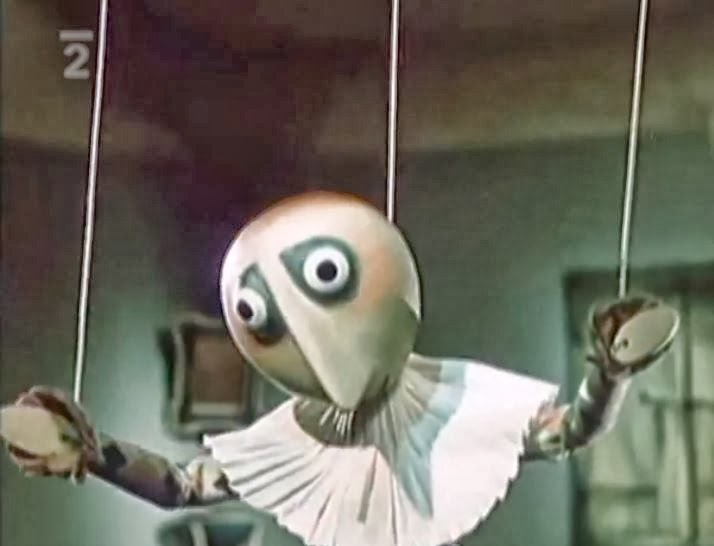
In about the same time as this video, The Hand by Jin Trnk, in which a puppet is forced against his will by a Hand, which I believe symbolised the dominance and superiority of the Nazis in WW2, the puppet sculptor caged and made to create this sculpture for the Hand. The Puppet manages to escape and unfortunately dies an ironic death as the thing he cherishes the most ends up being the end of him, his beloved flower pot.


The animation style of both of the videos differed, through the modelling and stop motion of 'the hand' and the traditional cel animation of Surogat. I felt that both of the animations styles used worked well with the plot of the videos, for example with "The Hand", the modelling and stop motion seems to make the audience grow attached to the puppet, whereas the "Surogat" uses cel animation which connects to the audience immediately with thoughts of entertainment and comedy, just through the line and colour used.

The background context of both animations blend into each other, through the aftermath of WW2, the cold war, and the great depression. I felt that the Surogat animation wanted to be entertaining to lift peoples spirits up from the devastation of the great depression, which left families homeless, the lack of jobs and the heightened mass amount of the unemployed. The animation was much like an aid for an escape from reality.


Watch "Ersatz (Surogat)" on video above


Watch another example of Dusan Vukotic's work, Osvetnik on the video above


Friday, 18 October 2013

Animation - Jiri Trnka - The Hand 1965

In this animation, Trnka uses model and film to create his work which is engulfed in a dark mix of context, with the height of the cold war, the repression of the art practice and 20 years after WW2. In this video it shows clear superiority from the Hand, which I believe represents the Nazi's rein through how violent and manipulating the Hand became after the puppet sculptor refused to make work for it. The symbolisation of how the Hand manipulated and controlled the puppet, much like a puppeteer, was brilliantly portrayed, as it showed how the puppet was forced against his will, caged and made to create this sculpture.


Still from animation

Still from animation

Near the ending of the video, it became quite ironic, through what he loved the most, his potted plant, ended up killing him. After the puppets death, the Hand gives him a burial, surrounded in propaganda in which the puppet had no belief or want in, that makes me feel that, in a way, he is being disrespected with the only escape of this propaganda is in death. As morbid as my opinion sounds, I believe this is among the main underlying meaning, through the horror of Adolf's rein and torture of his superiority.


'Adolf  the Super man' - John Heartfield - photomontage
Throughout watching the video, I couldn't help but be reminded of John Heartfields work, in which he too made imagery that showed the suffocating manipulation and greed of the Nazi's, but he also made mockery of these figures with in his work. For example in the piece "Adolf the Superman", he uses photomontage to his advantage, including x-rays, to show the money with in his stomach, symbolising greed, with the Nazi symbol as his heart to symbolise his thirst for power and dominance. Even the title of the piece, makes the piece surreal.


Wednesday, 16 October 2013

Illustration - Norman Rockwell


Norman Rockwell was an American illustrator who obtained a realism based style with his own twist through the expressions and body language of his designs. Rockwell's work was so influential with his illustrations, to the point of debate whether or not Rockwell was an icon of the 20th century. His illustrations are beautifully made, through his use of colour and painted media, which gives a soft and realistic edge to his work and makes you clearly see how time consuming his work must have taken. Rockwell's work can be interpreted to be avant-garde, an artist who is innovative and includes themes of political and cultural context.

Freedom from want, 1943

This can be seen through these propaganda posters that were created during the second World War, propaganda that was made to make America feel at ease and remember what they were fighting for. Rockwell created imagery that reminded the public of the comforting American lifestyle, for example one of the posters depicts a family sitting down to a thanksgiving meal, every face smiling to show the audience what a good time it is with family, with the caption "freedom from want". This poster is matched with another three, "Freedom from Fear", "Freedom of Speech" and "Freedom of Worship", all of these posters aimed against the rise of war. These images became almost an delusional identity for American life through out the duration of both the great Depression and WW2.


After Prom photography reference


After Prom

It was interesting to see the difference with in the photography reference and the finalised illustration. I could see the small changes that he had made to the illustration, for example, the expression and body language of the chef/waiter as he leans in towards the flower, the position of his arm was bent, making the movement of him leaning in to smell the flower more fluid and less ridged. The body language of the two characters before the man, have changed also, through the slight position of the boy's arms and the angle of the girl as she shows the man the flower she has been given. These slight changes from the main reference works well within the illustration as it not only contains Rockwell's twist on his realistic style, but makes the design, in whole, more animated.


Rockwell's work is interpreted to be one of the last illustrators of the era, when artists and advertising were reliant of the illustrator for key ideas, however through the rise of contemporary art and modernism there has been a decline in illustration. I believe this is due to the advancement of technology, leading to computer generated illustrations and graphic design, and the process of photomontage, which has seemed to have engulfed most of traditional illustrators, much like Rockwell's work.


Image reference for Normal Rockwell and Quote:
http://onlinebrowsing.blogspot.co.uk/2012/03/norman-rockwell-it-wouldnt-be-right-for.html

References:
http://underpaintings.blogspot.co.uk/2013/05/random-inspiration-norman-rockwell.html
Context of Practice lecture notes 

Tuesday, 15 October 2013

Photography - Mass Observation

Mass Observation was a movement in 1937, thats sole purpose was to document and study British behaviour.  (The main founders being - Tom Harrison, Humphrey Jennings, Charles Madge and Humphrey Spender.)   Humphrey Spender was known for his photography within the work town project, the photography being judged through a theme of difference between the working and the upper class. Spender and other photographers within this group would train from London to Bolton to document the working classes way of life. I find this quite interesting through how the Mass Observation group, filled with the rich upper class would take it upon themselves to document the working class. It seems odd, through how this can be taken harshly with the thoughts of snobbery due to documenting a poorer community from the one in which they came from.


http://www.massobs.org.uk/images/content/boltonpub.jpg
Worktown Project - Bolton


The photography taken is interesting through its' composition and contrast of the black and white image. The use of the foreground of the dogs and the background of the content of the bar, gives the image a sense gradual depth but also how small the area is, in which the people have gathered in to get a pint.
The expressions of the men at the table are quite irritated through one of the mans glance with his body posture, as if to say, "thats enough now". On this table, we are not able to see the third mans face, however we are able to see with in the mirror in the background. Whether this was deliberate or not, it adds to the image. I feel that this creates an atmosphere of alienation in the sense of his body language and the angle of reflection with in the mirror.

The worktown project reminded me of Robert Doisneau's work, for example his "Les Animaux Superieurs" photograph containing a crowd surrounding a trapped monkey with a lead around its neck. (Doisneau's work is well known in France, with a series of postcards containing the most iconic pieces. His iconic images are known to refer to modern society, showing images that would be acceptable in the past and not in the present. For example, kids playing on the road until dark, this would not happen today as society has changed and there are more dangers for parents to worry about.)


Robert Doisneau - Les animaux superieurs 

This image holds a strong thought provoking theme, of  "which is the animal?". The crowd in this image act like flies as they try to get closer to the tied up monkey, a sense of entertainment for the crowd. The images main portrayal is the cruelty towards the monkey which is brilliantly displayed through the gathering of the crowd and the expression of the monkey's face, the outfit placed on the monkey gives off an atmosphere of a sadistic nature, through how the 'Owner' has made the monkey more interesting by adding a costume. It shows how different entertainment was in the 1930s, during the great depression which cost a tidal wave of countless lack of jobs and homes for millions of people worldwide. The great depression just hit before the start of Hitlers rise to power, and the commence of WW2.


references
Context of Practice Lecture notes
http://blog.ricecracker.net/tag/robert-doisneau/

Sunday, 13 October 2013

Introduction to Context of Practice Lectures

For the first Context of Practice Lectures, I was given a short introduction into different art disciplines and media, such as photography, animation, illustration and typography. The lecture also gave a summarised contextual background to the work and discipline shown on the slide which was interesting to see how much that influenced the work itself. Over the next few blogs, I will be researching more into the topics shown at the lecture presentation.