Tuesday, 25 March 2014

Cop Animation

For my first take on the animation, I gained feedback from my group and all agreed that the ending image did not look as if she was dealing drugs, as the imagery did not really look like drugs. I went back to fix this by adding needles and other detail that would relate to the drug impact.
I believe that this worked well as comparing the image back to the previous, I could tell how much the previous image did not relate to drugs. Adding this little part of the imagery worked well as the transition between the beginning zoom in image would not normally be thought to be put together.
Using After Effects to animate worked better than using Photoshop as it was less time consuming and easier to use. For example if I had used Photoshop frame by frame, I would have more frames to make up for the time duration and it would not run as smooth, as I would have to move the image for each frame, which would have made the animation seem jagged.

I feel that my animation works well as it relates to the idea I had in mind and relates to the essay, with the deception of the avant-gardist work, depicting what seems to be a normal landscape to one which actually relates to a red light district.

I really enjoyed this make and do brief as it was interesting trying to portray a part of the essay into an animation. As I had chosen to write about the avant-garde, I found it difficult to think of ideas that did not involve me trying to create an animation that experiments with different animation techniques and media as that was too obvious and hard to try and make something that would be deemed to be avant-garde, I wanted something that took influence from the essay, so using this idea from the start of my essay, I believe that it has worked well, as the idea captures the thoughts of the avant-garde artists.

Cop animation continued

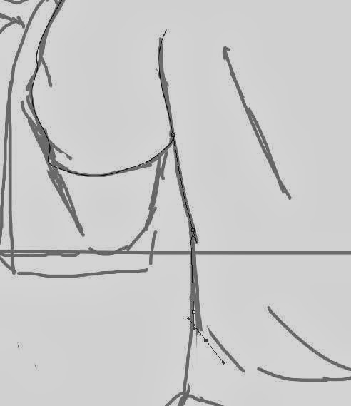
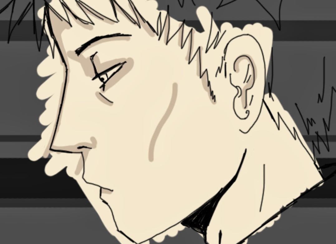
To create the imagery, I used Photoshop to create the lineart and fill, I found that Photoshop was the best program to use to design the image as it is easy to use and has the tools necessary to create the aesthetics. I first placed the quick sketch from the previous blog post of the man sitting in the window of the diner, and added rough detail to the character. From this I used the Pen tool to create smooth lines for the lineart, I was able to create smooth curved lines through the use of the anchor points and lack of points, the less points the smoother and contoured the line will be.

From this, I added colour to the piece, by using the brush tool and eraser tool to ensure that the block of colour was within the lineart. I found that when colouring, it helped to colour on a non white background to make sure that you are not using to bright or too dull colours for the fill, using a grey background for example makes the colour standout more and easier to correct if you have the wrong hue. If this image was going to print, I would ensure that the mode was set to CYMK and the colour would be chosen from Pantone hues, so that the printers would know the exact colour to print.
However as this would be for screen only, I ensured that the mode was RGB and used the normal colour wheel as the screen can depict the colours correctly; having said that, there are some screens that perceive colour differently, depending on the brightness and saturation that the monitor is set on.

Rough detail on sketch image
Using the Pen tool
Adding colour
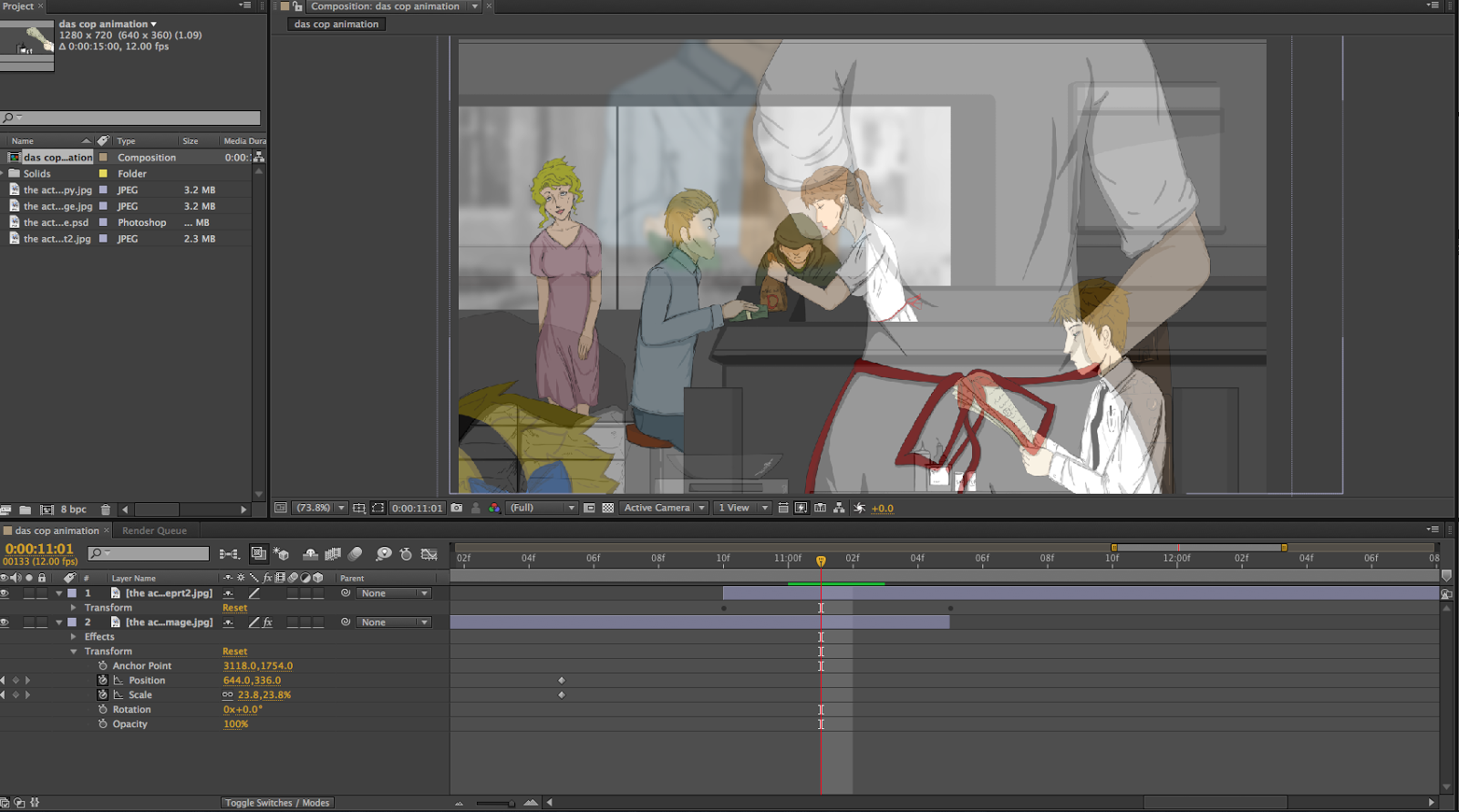
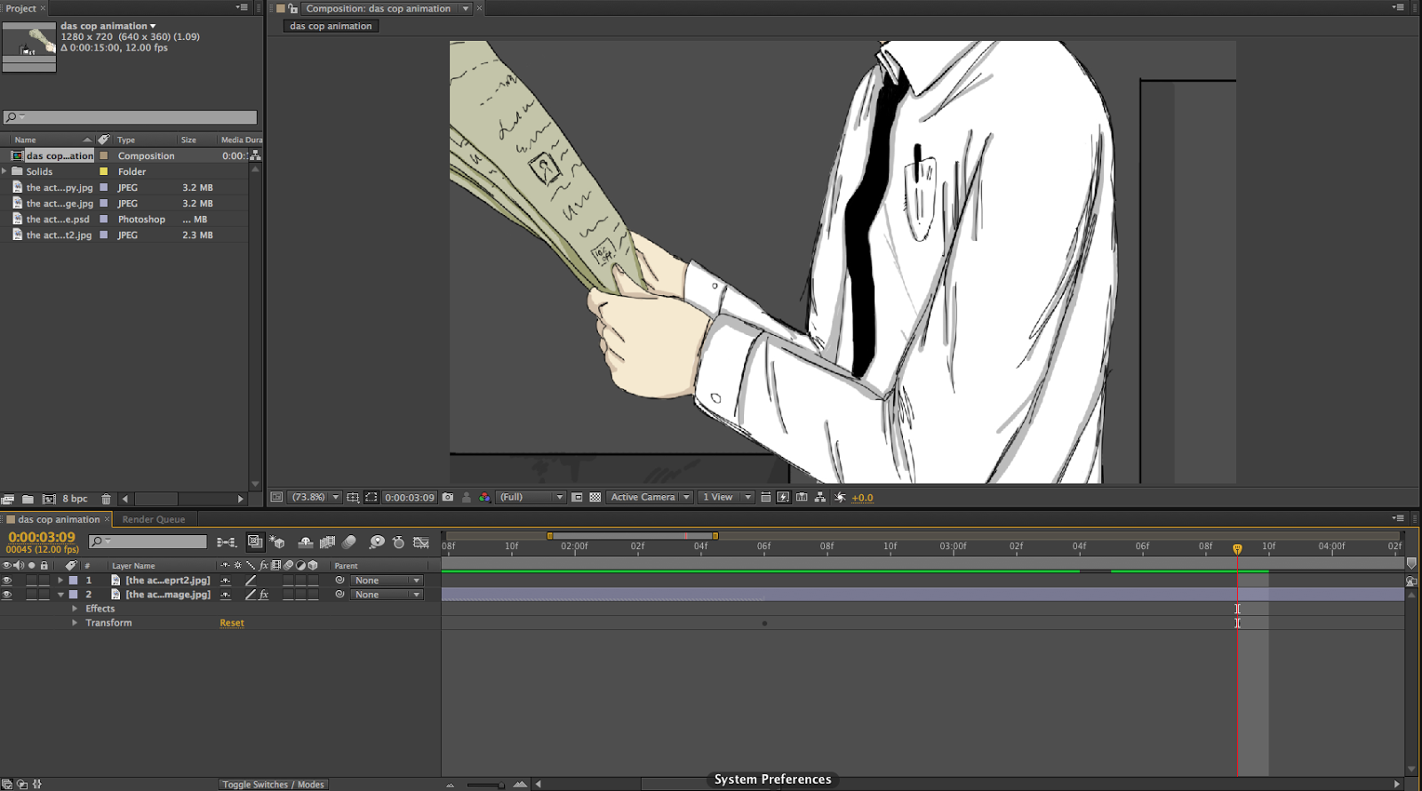
From using Photoshop, I then used After Effects, which I would be animating with. I chose to use After Effects as I would be able to use the transform key points, which allow me to fade and fade in, resize, rotate and move across the frame.
With these key points, I was able to pan across the image, resize and fade into the next image.
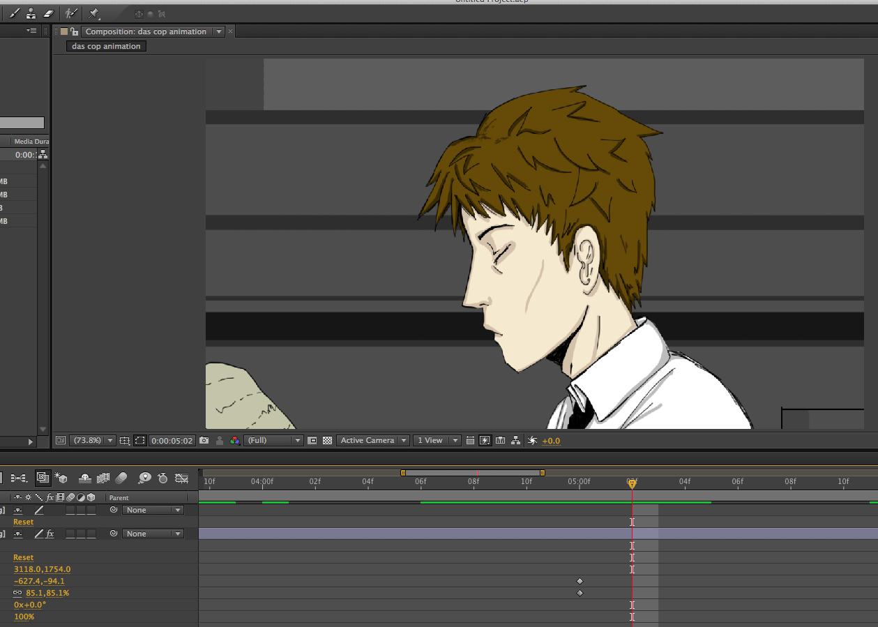
I found that using key points difficult as if I change the position of the first point too much the end point of the movement would change as well, however I was able to fix this by moving the first point which effected the end point, and then moving the anchor point made the transition of the movement work again.

Example of the key points for the position transform tool

I mainly used the position and scale tool as it helped to achieve the zoom in look into the image.

I used the opacity transform points to fade the main image with the ending image,
I believe that this worked well as it transitioned smoothly. 
I made the character wink by using the paint brush tool, opening the layer and drawing
over the top of the eye at different points of the duration of the image, and removing the
layer of paint by using the eraser tool. If I had just deleted the paint layer on top of the eye at the end of the
duration of the blink, it would have deleted the wink animation. 


Cop Animation Progress and inspiration

I quickly sketched out a storyboard that consisted of zooming into the image, starting with an image that looked and appeared like an ordinary visual, but the audience see the 'bigger picture' as we zoom out to the full image. I decided to zoom out to see the waitress dealing drugs to the customer in front of her.
I wanted the story to show how a normal image is actually deceitful in which it is a well known dealing place.

Start with a normal image, someone in seen in a window of a diner and
then zoom into the image, from this we zoom into the counter with the
waitress.  Experiment with long and medium shots.

As we zoom into the waitress, we turn to see the back of her head to see the
customer she is serving...

... and we see what she is dealing him. I couldn't decide whether to draw her dealing
drugs or guns, but both have the same impact. 

I developed the idea further by gaining inspiration from secondary imagery of American diners. I found that each diner picture contained a red colour theme, with a mixture of wooden interior decor.
The seating was mixture of stools surrounding the counter and booths with tables, with the lighting directly above.

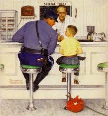
I was also inspired by Norman Rockwell's and Edward Hopper's work with their dinner inspired illustrative painted compositions. Rockwell's work portrays the figure in a realistic yet elongated and altered characteristics which make the figures seem to absorb a cartoony appeal. It was helpful to see how the figure was in relation to the stool that they were sat on, in my inspired sketches, I could not get the proportions right with the legs.


Norman Rockwell


Edward Hopper 

Norman Rockwell


From these images I sketched examples of the diner which could be used with in my animation, I considered the layout of the diner apart from the counter, and how customers would act or do in the diner. I imagined people either reading a book or eating, and drinking coffee while situated at the diner whilst this misdeed would take place.


Thought about the view of the final image, where the audience will see the
dealing of drugs or guns. I think a closer shot would work better than the long shot as
it would emphasise the impact of the misdeed. 
I feel that this image worked well as it would be a great for the first scene
of the animation through the normal view of a person at the diner.
I would then zoom into the image to show the waitress dealing. 

Sunday, 23 March 2014

Synthesis


 Reflection – Theory – Action

  • Interested in the process as well as the final product, finding ways to develop, experiment and explore these issues.
  • Setting out to comment, investigate something, to position yourself in someway, show your opinion
  • You need to take what is out in the world, other artists, books and use them to position yourself and make your own statement
  • This module should be a test to experiment and take the practice and work in a different manner
  • To get an Honor's level degree, you have to evident the skills in other degrees.
  • Five learning outcomes (-knowledge and understanding)
    - 4A1: Think about the contextual backgrounds and aesthetical considerations
  • P: Political
    E: Economic
    S: Social
    T: Technological
  • It is about making but in this module, think about what you do and how it is shaped by contextual means, how do my own attitudes impact on what I do.
  • What do the materials, and advancements in technology and social media affect my work?
  • Photography example by David Hoffman
  • A documentation on the documenters, everyone has a good camera in their phones, becomes a historical documentation, the state uses the media to document and supposedly use to stop crimes, e.g. CCTV, cameras, forensic science etc, use it for social control and moral demonstrations.
  • Cognitive Skills
    4B1: Think about the relationship between the theoretical and practical context in your discipline research, into reflection and making.
    4C1: Primary and Secondary Sources.
    4D1: Practical and theoretical research demonstrating awareness
  • Informed engagement, taking a step back and thinking why are you doing what you are doing.
  • Thought, thinking and philosophy behaviour critic of the world. Praxis sums up – turn into existence through making.
  • Bringing theory and action together
  • Practice is the centre of everything. We all have different thoughts and process that aids development.
  • “For” – investigations you do in order to enable what you make
    “In through” – the act of doing, making work is not just done but a form of research
    “In front of” – Aim for audience
    “Behind” – Contextual background, meaning, morals

  • Kolbs theory – experimental learning theory – having an idea on the word (Abstract conceptual) and researching into the process of the idea of which experimentation. This then leads to new experiences, finding a way of working that it deepens the though of your process and allows you to do what you love on a different level… Record and Evidence!

Saturday, 22 March 2014

Communication in Mass Media

Communication in mass media can also be known as in an art school context, as communication design/visual communication and graphic design, (typography, advertising, propaganda and printed media).
  • A means of communication reaching a large audience, that reach the public in a short amount of time, for example newspapers, television and radio. 
  • Todays communication relies on technology and varies with which media it is broadcasted on.
    Print media, that has a physical state, such as newspapers, books, comics are used to distribute information. Lastly outdoor media, billboards, signs, posters, placards. 
  • Communication with in art can be seen to have begun in the stone age with cave paintings and Cuneiform symbols. These can be considered a form of documentation of recording events that would have happened during that era. This can also be linked to the Hieroglyphics of ancient Egypt, with the pictorial art that decorated the inside of the tombs. 

  • Interestingly, in the 14th century, fresco paintings were used to communicate with the illiterate, as everyone had a basic understanding with what images mean. In this era only the rich would be educated, and not the poor, so the majority of the public would rely on this fresco painting of a form of communication with documentations of events. Therefore an artist occupation was seen as important, a means to communicate with visual aesthetics.
  • The term Graphic Design was introduced by William Addison Dwiggins,
    "In the matter of layout forget art at the start and use horse-sense.  The printing-designers whole duty is to make a clear presentation of the message - to get the important statements forward and the minor parts placed so that they will not be overlooked.  This calls for an exercise of common sense and a faculty for analysis rather than for art"
  • Paul Rand: '...graphic design, in the end deals with the spectator, and because it is the goal of the designer to be persuasive or at least informative, it follows that the designers problems are twofold: to anticipate the spectators reactions and to meet his own aesthetic needs.
  • The Bauhaus Logo was created in the same year as the term Graphic Design was approached; The Bauhaus logo set a standard for other logo designs. 
  • Although Graphic design can be interpreted to have been made from the consumerist and capitalist interests, it has arguably become more concerned with social issues. 
  • We can see a link between graphic design and other art disciplines, such as fine art and advertising. However there are many interpretations that graphic design and advertising are completely separate, when we merge graphic design and advertising, which does it become labelled with? A piece of graphic design or an advertisement?
  • For example, Alphonse Mucha was famous for his Art Nouveau posters and advertisements for consumables, however the design never included a large image of the actual product, it was always Mucha's famous illustrative design of women that would cover the advertisement, with the product drawn small or never shown. This can be interpreted that the consumer is lead through vaintiy for aesthetics, which I believe to be true, the saying "Never judge a book by its cover" is lost and the look of the packaging of the product becomes important. In conclusion, I believe that in this case, graphic design has taken over the advertising label, and in doing so has actually aided in the amount of sales of that particular product.

    Mucha - poster for cigarette papers
Important artists in Graphic Design:
  • Charles Rennie Mackintosh
  • Wassily Kandinsky
  • El Lissitzky
  • F.H. Stingemore - created the london underground map which was developed by Henry C. Beck in 1933, with Edward Johnson creating the typeface for which.
  • Laszlo Moholy-Nagy
  • G.Klucis
  • Paul Rand
  • Saul Bass
  • Barbara Kruger